22.09.2015 by roberts
The pie chart is one of the most used and hated chart types of all times. It’s shape is very familiar, but this visual representation is easily misleading if not used properly. Here at Infogram, we’ve decided to take a closer look at this controversial chart to help you avoid common mistakes people make every day.
History
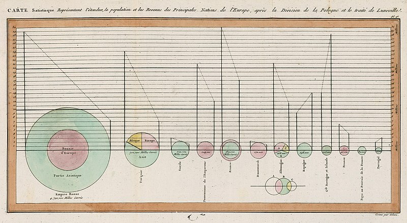
The pie chart has been around for over 200 years. It was first invented in 1801 by Scottish writer on political economy William Playfair (1759-1823), nowadays known as the inventor of statistical graphs. At the time Playfair believed “making an appeal to the eye when proportion and magnitude are concerned, is the best and readiest method of conveying a distinct idea” (William Playfair, The Statistical Breviary, T. Bensley, 1801, p. 4) and the pie chart and bar chart were born. Some people believe that he also invented the line chart, but that story is better left for another time.
His first notable use of the pie chart was to compare geopolitical territories represented by circles, sometimes segmented in slices, like in the case of that of the Turkish Empire (second circle from the left).
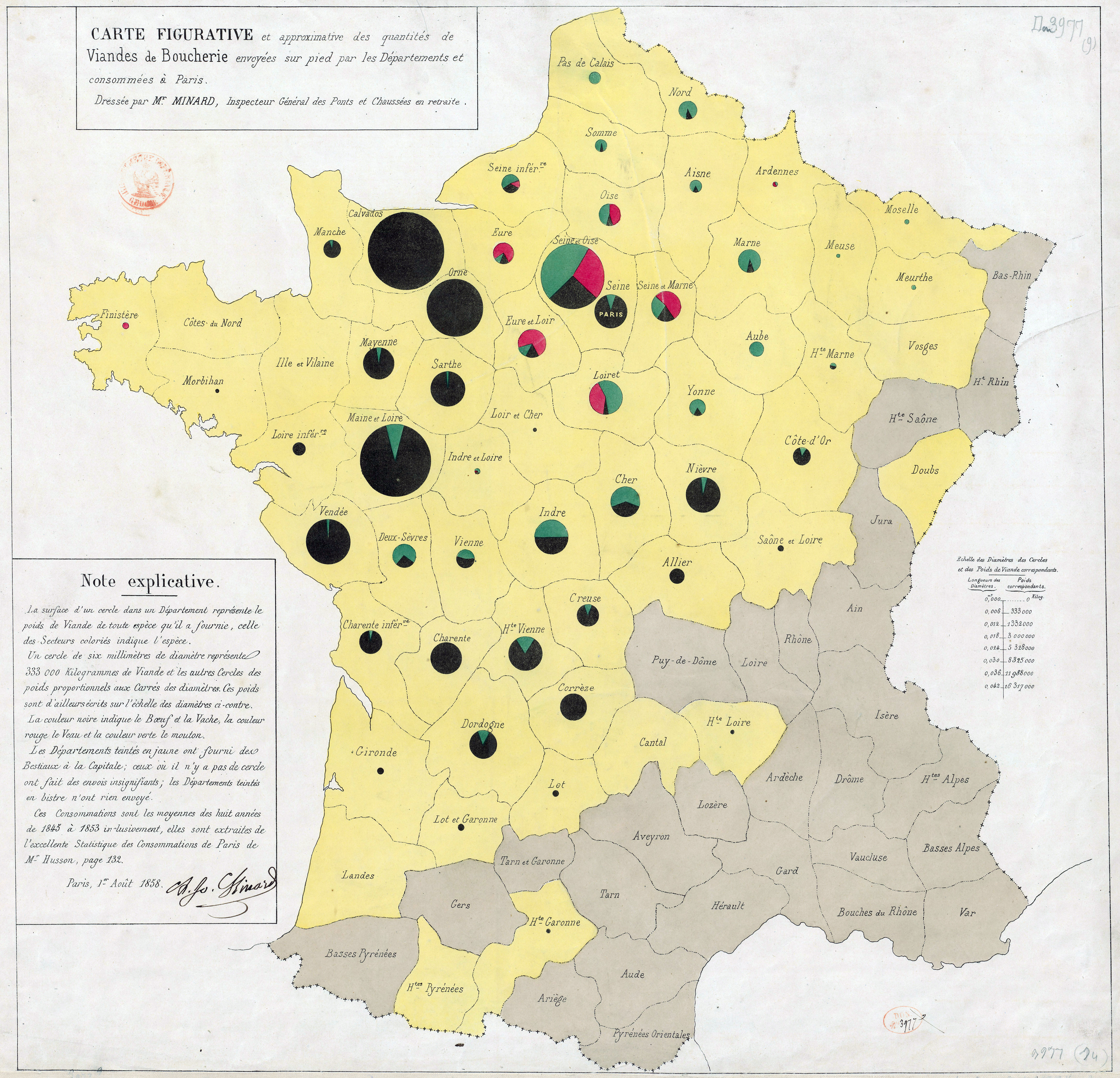
The invention was almost forgotten until 1858 when a French civil engineer Charles Joseph Minard created a divided-circle map, showing the amounts and proportions of butcher’s meats supplied to the Paris market. (Learn more about Minard’s influence in data visualization from Sandra Rendgen’s keynote at Malofiej 23)
At about the same time Florence Nightingale, the English nurse, social reformer and statistician used a polar area diagram (first invented by André-Michel Guerry, a French lawyer and amateur statistician) to show the dynamics of the mortality causes of the British Army in the east. Each sector had equal angles and differ only on how far the radius extends from the center of the circle.

Pros and cons of using pie chart
As of today pie charts are one of the most popular data visualization formats, despite criticism from data visualization experts that say that the human brain can easier compare length than angle. Most of the critics recommend using bar chart instead, as shown on the image below. AS you can see, all of the pie charts look similar… until we convert them into bar charts and then you can clearly see there’s a significant difference between them.

For this very reason, hatred of the “evil pie charts” is very common among data visualization experts. Here’s what some of them have said:
“Its [pie chart’s] colorful voice is often heard, but rarely understood. It mumbles when it talks.” Stephen Few, Save the pies for Dessert
“The only worse design than a pie chart is several of them, for then the viewer is asked to compare quantities located in spatial disarray both within and between pies” (Edward Tufte, The Visual Display of Quantitative Information, Graphics Press, 1983, p. 178.)
“There is no data that can be displayed in a pie chart that cannot be displayed better in some other type of chart.” John Tukey
“It’s useless to think of “big data” if the end result is a 3D pie chart flying in a Powerpoint presentation.” Jorge Camoes interview on Visualoop
However, pie charts do have some strengths. Stephen Few, a data visualization expert and teacher at the renowned university of UC Berkley, names some of them; the message “part-to-whole relationship” is built right into it in an obvious way and it’s shape is very familiar. Children learn fractions by looking at pies sliced in various ways and decoding the ratio (quarter, half, three quarters, etc.) of each slice.
To sum up:
Pros:
- Shows part-to-whole relationship
- Familiar shape
Cons:
- Difficult to read, because it’s easier to distinguish difference in length, than in angle
- It’s very easily misused
Transformations
As time went by, pie charts experienced many adaptations and transformations, and ended up converted into things like doughnut charts, exploded pie charts, polar area diagrams, multilevel pie charts and 3D pie cakes.
Infogram offers three of the most widely used pie chart types (classical pie chart, doughnut chart and irregular polar area diagram). Here’s how they differ:
- Pie chart – compares the values of categories as part of the whole, displaying angle-size differences. Example: Quantity of Ford cars by color sold this month
- Doughnut chart – compares values by displaying differences in length and allows the empty center to be filled with additional information. Example: Quantity of doughnuts sold in each state of the US, plus a fact about the obesity rate in the state where doughnuts are being sold the most.
- Irregular – Compares data through differences in the length of the radius of each segment. Example: How many people were affected by the flu every month of the year
If, after all that’s been said, you still decide to use a pie chart, here are some best practices that you should follow:
Best Practices
-
- Compare maximum 5 categories
- Organize your data from the largest to the smallest value
- Compare categories where the size of each slice is close to 0%, 25%, 50%, 75%, or 100%, especially if they are in a recognizable position
- Don’t compare two pie charts side by side. A line chart or an area chart would work better for that
- Don’t compare ratios that add up to more than 100%
- Use for “parts of the whole” type of stories
- Be creative 🙂
Would you like to experience the full power of data visualization? Try Infogram for Teams or Enterprise for free! With a Team or Enterprise account, you can create up to 10,000+ projects, collaborate with your team in real time, use our engagement analytics feature, and more. Request your free demo here.
Get data visualization tips every week:
New features, special offers, and exciting news about the world of data visualization.