18.01.2024 by Anete Ezera
Maps are an incredibly powerful tool for helping people understand the world. Different types of maps can tell stories that happen across different locations and times. They can simplify complicated data sets and geographical information in an engaging and interactive manner. With different types of maps, you can also either choose to see the bigger picture of the whole world, focus on a single country, or zoom in on specific regions. No matter the scale, maps can help you explore and understand the many layers of the world.
As a data visualization tool, maps add depth and simplicity to your work. They can make any report, presentation, or article visually stimulating and engaging, which keeps viewers interested and helps build your credibility. However, if you’re looking to create a map, you might be overwhelmed by the options, so the question is: What are the different types of maps, and which one should you use? In this article, we’re going to explore when to use maps, what are the different map types, like choropleth and bubble maps, and what are the best use cases for each of them. Let’s dive in!
When to use maps?
Maps are used to help visualize geographic data. But, just because you have data that can be mapped, doesn’t mean you need to. It’s crucial to recognize when a map is the most effective medium for conveying the intended message. Maps are great tools for highlighting locations, patterns, distribution, proportions, and movement. If you need to analyze data rather than just display it, charts or graphs might be more suitable. Therefore, selecting the appropriate visualization method is crucial to effectively communicate the underlying message.

Types of maps: Political, physical, thematic, and general
Maps convey information about our world, and understanding the various types of maps is key to effective communication. Broadly speaking, maps can be categorized as either political or physical, each serving distinct purposes. Additionally, another classification includes thematic and general maps.
Political maps
Political maps are a fundamental type of representation that focuses on depicting territorial boundaries and political divisions. These maps showcase the layout of countries, states, counties, major cities, and bodies of water. The primary purpose of political maps is to offer a clear understanding of the administrative and political structures that define regions. These types of maps serve as tools for understanding the political landscape, helping to analyze geopolitical situations, and providing context for international relations. Political maps are used as resources for diplomatic discussions, historical studies, and educational curricula by visually presenting the organization of nations and their subdivisions.
Example: Political maps are extensively used in educational settings to teach students about the world’s countries, their capitals, and political divisions. Additionally, they’re crucial in news reporting, allowing viewers to visualize geopolitical events and understand the context of global developments.
Physical maps
In contrast, physical maps focus on showcasing the natural features and physical attributes of a geographical area. These maps provide detailed water, vegetation, and other natural features. Physical maps offer a visual narrative of the earth’s surface, emphasizing its diverse landscapes and environmental characteristics. They’re most helpful for scientists, geographers, and environmentalists, helping in the study of ecosystems, geological formations, and climate patterns.
Example: Physical maps are frequently used in environmental research and exploration. Geologists use physical maps to study the earth, identifying mountain ranges, valleys, and tectonic plate boundaries. Ecologists use these types of maps to analyze biodiversity by examining vegetation patterns and identifying different ecosystems. Physical maps also contribute to the planning of outdoor activities, as they provide information about natural features.
Thematic maps
Beyond the difference between political and physical maps, another crucial classification is between thematic and general maps. Thematic maps, also known as special-purpose maps, are designed with a specific theme or subject in mind. These types of maps go beyond representing geographic locations; they focus on illustrating a particular aspect or variable related to a specific region. Thematic maps can cover a wide range of topics, including social, economic, cultural, or environmental themes.
Example: A thematic map might represent the distribution of average annual rainfall across a continent, providing insights into climate patterns. Another thematic map could display population density, allowing viewers to grasp the concentration of people in various regions. These types of maps are helpful in fields such as sociology, economics, and public health, where spatial patterns of data are crucial for analysis and decision-making.
General maps
On the other hand, general maps, also known as reference maps, serve a more comprehensive purpose. They aim to provide a broad overview of geographic features without focusing on a specific theme. General maps hold a lot of information, including political boundaries, topography, transportation networks, and landmarks. These types of maps are helpful tools for navigation, orientation, and gaining a holistic understanding of an area.
Example: A general map of a city might include details about streets, parks, landmarks, and neighborhoods, catering to both locals and tourists seeking an overall view of the city’s layout. General maps are commonly used in atlases, tourist guides, and educational materials to provide a broad overview of geographic information.
In summary, the classification of maps into political, physical, thematic, and general types allows us to explore the diverse ways in which maps can represent and convey information about our world. Each map type serves a specific purpose, catering to the needs of different fields and disciplines, and collectively, they enrich our understanding of our global landscape complexities.
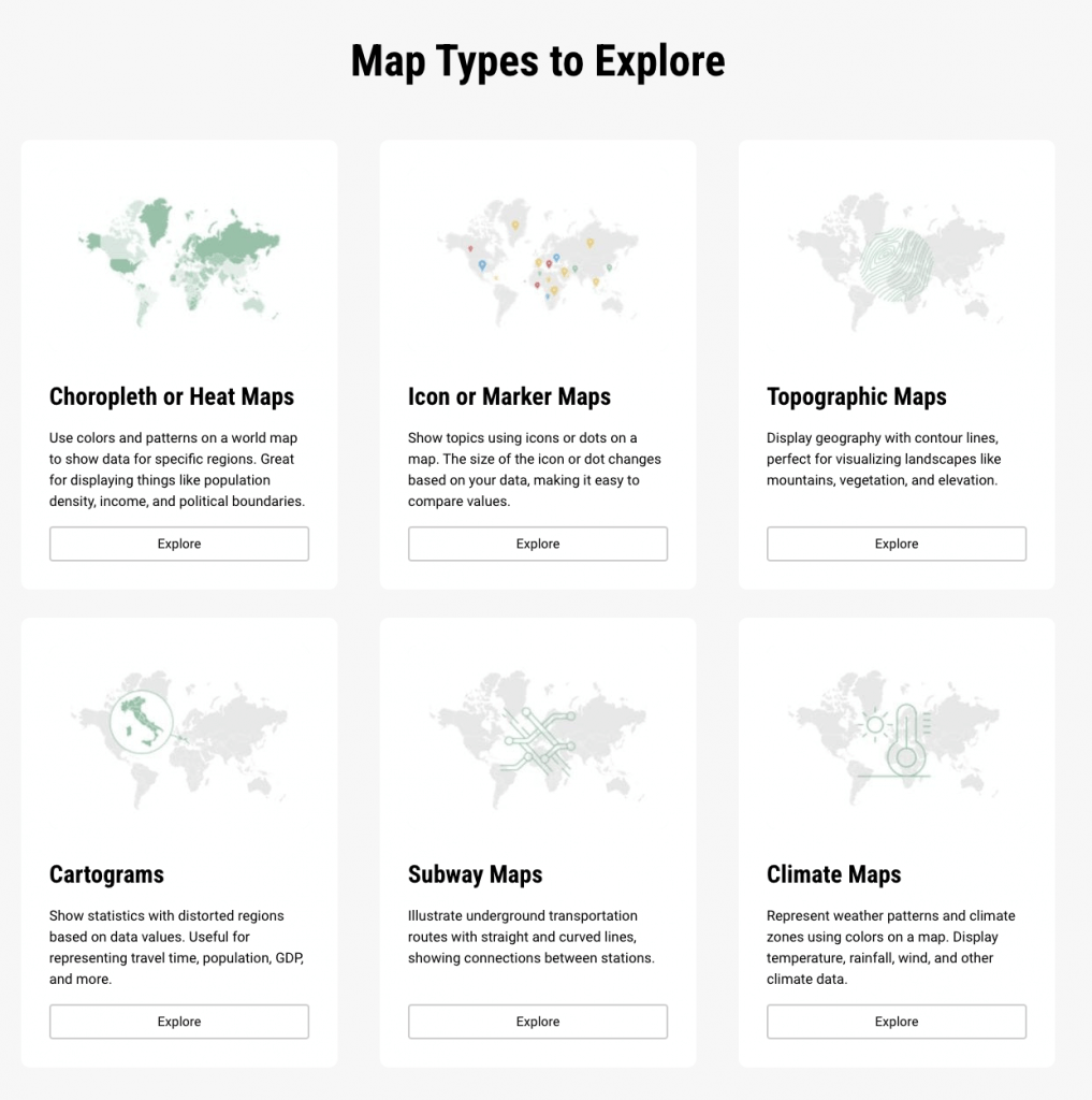
Different types of maps
Different types of maps offer diverse perspectives for visualizing geographic and thematic information. Each map type serves a unique purpose. From illustrating variations in data across regions to emphasizing thematic variables and revealing spatial patterns, maps play a crucial role in conveying information in an engaging and understandable manner. Let’s explore some of these maps!
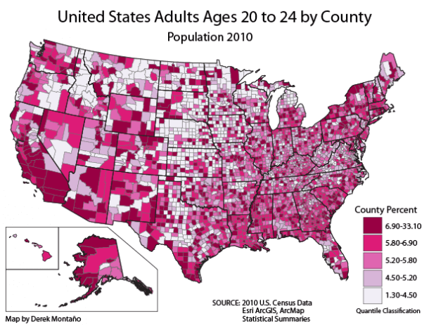
Choropleth map
Choropleth maps are widely used to illustrate variations in data across geographic regions. The key characteristic of these types of maps is the use of colors or shades to represent different levels of a specific variable. Commonly used to depict population density, land ownership, or economic diversity, choropleth maps provide an instant visual understanding of patterns and trends within a given area. For instance, these maps are frequently used in election analyses to show voting patterns in different regions, helping to differentiate political preferences on a national or regional scale. Choropleth maps are instrumental in highlighting disparities and trends, making them a popular choice for data-driven presentations and analyses.
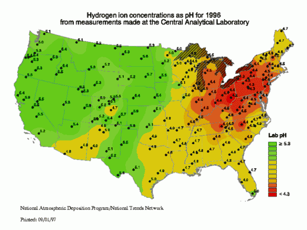
Isarithmic map
Isarithmic maps, often referred to as contour maps, offer a unique way of visualizing smooth, continuous phenomena like elevation, temperature, or precipitation. Each contour line connects areas with the same value, creating a 2-D representation of a 3-D surface. These maps are extensively used in environmental and geological studies to represent topographical features. For instance, isarithmic maps are vital in illustrating temperature gradients across a region, helping meteorologists forecast weather patterns. Additionally, they’re used in geology to showcase elevation changes, helping researchers and planners understand terrain variations. Isarithmic maps are great for portraying gradual transitions, making them highly useful in fields where nuanced data representation is crucial.
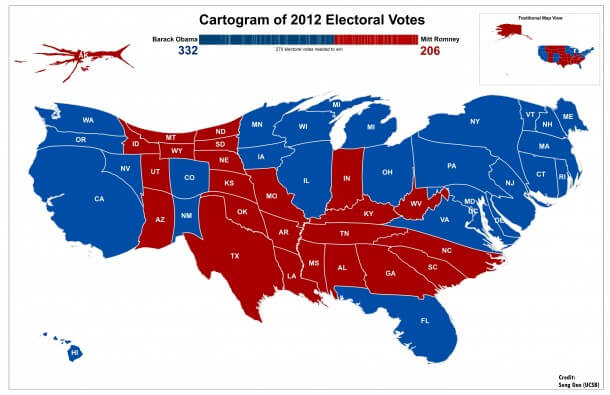
Cartogram
Cartograms are unique maps that distort traditional geographic shapes to emphasize thematic variables. These types of maps come in two primary forms: area cartograms, which alter the size of regions based on a specific variable like population or GDP, and distance cartograms, which distort distances to represent travel time or connectivity. Cartograms are widely used in representing socio-economic data, providing a nuanced understanding of regions based on factors other than their physical size. For instance, a population cartogram might emphasize densely populated urban areas, providing a more accurate representation of demographic patterns. Similarly, distance cartograms can be used to visualize transportation networks, showcasing areas connected by efficient travel routes. Cartograms are valuable tools in challenging traditional perceptions and highlighting non-spatial relationships.
Flow and connection maps
Flow maps illustrate the movement of people, goods, or information between locations. These types of maps are vital for understanding patterns such as migration routes, shipping paths, and airline transportation networks. They’re extensively used in logistics, urban planning, and epidemiology. For example, flow maps can display the migration patterns of wildlife, aiding conservation efforts. In the context of urban planning, they help visualize traffic flows. Connection maps, on the other hand, emphasize the links between two locations, making them ideal for showcasing geographic relationships and dependencies. They find applications in fields like supply chain management and network analysis, offering insights into the interconnectivity of various locations.
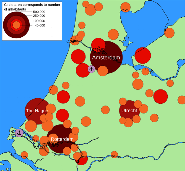
Bubble map (proportional symbol)
Bubble maps, using symbols of varying sizes to represent data, are effective for comparing proportions over geographic regions. These maps find applications in diverse fields, such as economics, demography, and healthcare. For instance, in economic analyses, bubble maps can represent the GDP of countries or states, with larger bubbles indicating higher economic output. In demography, they might depict population density, with larger bubbles signifying more densely populated areas. Bubble maps are also utilized in healthcare to represent the prevalence of diseases across regions, where larger bubbles indicate higher incidence rates. The visual impact of varying bubble sizes aids in quickly understanding the relative proportions of the represented variables.
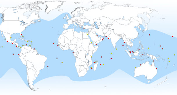
Dot map
Dot distribution or dot density maps use individual dots to signify the presence of a feature or phenomenon on a map. These types of maps are particularly useful for visualizing point data and revealing spatial patterns. Dot distribution maps can be applied in ecology, archaeology, and urban planning. For example, in ecology, these map types can represent the distribution of wildlife sightings or archaeological finds. In urban planning, dot distribution maps can illustrate the locations of specific amenities, such as schools or healthcare facilities. The scattered arrangement of dots provides an immediate visual impression of the spatial distribution of the represented data, making dot distribution maps an effective tool for conveying point-specific information.
Icon maps
Icon maps are graphic representations that use symbols or icons to convey information about a specific geographical area or location. These maps depart from traditional cartography by employing visual symbols instead of traditional colors, lines, and labels. Icons on these maps can represent various features such as landmarks, points of interest, or specific types of businesses. Icon maps are popular for their simplicity and clarity, making them an effective tool for conveying information quickly and intuitively. They are commonly used in urban planning, tourism, and wayfinding applications, providing users with a user-friendly and visually appealing way to navigate and understand a particular area. Whether guiding tourists through a city’s attractions or helping individuals locate amenities within a complex space, icon maps offer a visually engaging alternative to traditional mapping techniques.
How to choose the right type of map
Choosing the right type of map for your data is crucial to ensure effective communication. Let’s explore the key factors to consider when selecting a map for your data visualization.
Understand your data
Before choosing a map type, it’s essential to understand the nature of your data. Ask yourself questions such as:
- Is your data categorical, numerical, or temporal?
- Does your data have a geographic component?
- What are the key patterns or relationships you want to highlight?
Knowing the answers to these questions will guide you in selecting the most suitable map type.
Consider your audience
The audience plays a crucial role in determining the effectiveness of your data visualization. Consider their level of familiarity with maps, their preferences, and the context in which they’ll interpret the information. Choose a map type that aligns with the audience’s understanding and makes the information easily digestible.
Color and symbol choices
Carefully select colors and symbols that are visually appealing and convey the intended message. Ensure that the chosen color scheme is easily interpretable and doesn’t introduce confusion. Consistency in symbol usage is also crucial for clarity.
Accuracy and precision
The level of detail required in your visualization is another crucial factor. If precision is essential, consider using maps with higher levels of detail, such as street maps or topographic maps. For broader overviews, simpler maps may be more appropriate.
Interactivity
Consider whether your data visualization will be static or interactive. Interactive maps allow users to explore the data further, zoom in on specific regions, and view additional details. Choose a map type that supports the desired level of interactivity.
Platform and medium
Where and how your data visualization will be presented also matters. Different platforms, such as print, web, or mobile, may have specific requirements. Choose a map type that suits the medium and enhances the overall user experience.
Create different types of maps with Infogram
At Infogram, we love maps – that’s why we offer over 200 regional territories that you can utilize to craft visually appealing maps ranging from global to local scales. From different types of maps to the real-time update feature, explore some of the key tools and functionalities available on Infogram to upgrade your maps!
User-friendly interface
If you’re looking for an intuitive and user-friendly interface, Infogram is it. With drag-and-drop functionality, users can easily upload their data sets and begin crafting interactive maps in a matter of minutes.
Diverse map types
Infogram caters to a broad spectrum of mapping needs with an extensive library of map templates. Whether you’re mapping global trends, regional variations, or specific locations, Infogram provides templates for world maps, country maps, and custom region maps. This diversity ensures that users can find the perfect template for their unique data visualization requirements.
Map examples
If you’re not sure where to start, Infogram also offers a great range of interactive map examples you can explore. These map examples illustrate the versatility of Infogram in transforming raw data into compelling visual narratives. Take advantage of this curated library to spark your creativity and ensure that your maps not only inform but also captivate audiences.
Dynamic data integration
One standout feature of Infogram is its ability to seamlessly integrate dynamic data into maps. Users can connect their maps to live data sources, enabling real-time updates and ensuring that audiences always have access to the latest information. This functionality is particularly valuable for tracking dynamic trends or conveying data that undergoes frequent changes.
Customization options
Infogram empowers users to tailor their maps to match their brand identity or specific design preferences. From choosing color schemes to adjusting marker styles and fonts, Infogram provides a comprehensive set of customization options. This flexibility ensures that every map created on Infogram is not only informative but also visually appealing.
Interactive elements
The true magic of Infogram lies in its ability to transform static maps into interactive experiences. Users can add clickable markers, tooltips, and legends to enhance the user experience. These interactive elements allow viewers to explore data points in-depth, providing a more engaging and insightful viewing experience.
Real-time updates
If you need to visualize real-time data like election results, you don’t want to constantly go back and re-publish your article. With the real-time update feature, you can simply update your map with the latest data and it’ll show up in your embedded maps instantly, eliminating the need to revisit the original location. Plus, you can seamlessly integrate multiple maps into a comprehensive view, improving the comparison and contrast of various data sets.
Embedding and sharing
Once your interactive map masterpiece is ready, we make it easy to share or embed it across various platforms. Whether you want to showcase your map on a website, blog, or social media, Infogram provides seamless embedding options and social media integrations, expanding the reach of your visualizations.
Ultimately, Infogram offers everything you need to visualize your data in a highly engaging way. Whether you’re a journalist visualizing election results, a business professional mapping customer locations, or an educator presenting geographic data, Infogram provides the tools to transform your ideas into captivating and informative interactive maps.
Map types: Final considerations
In conclusion, understanding the different types of maps and their applications is essential for effective communication and data visualization. Whether you’re highlighting patterns, connections, or proportions, choosing the right type of map can significantly enhance the impact of your message. Infogram’s user-friendly tools further empower you to create engaging and informative maps, making data visualization an accessible and powerful tool for all. Sign up now, and create a map today!
Get data visualization tips every week:
New features, special offers, and exciting news about the world of data visualization.