18.05.2016 by Anete Ezera
Graphic displays of information have the power to steer our thoughts and guide our minds. We use data visualizations to make sense of data and communicate important information. Bar and line charts are two of the most common ways people visualize data.
Bar charts are great for making comparisons among data points, and line charts are used to depict trends. We aren’t born knowing how to read these types of charts, it is a skill we develop over time, but there is a level of natural instinct involved that makes graphics so powerful.
The Psychology Department at Stanford University conducted a series of experiments to determine the effectiveness of these graphs and the ways they use space to convey meaning.
If you are interested in learning what to do, and what not to do, when creating the most popular chart types – download the ultimate data visualization guide!
![]()
Experiment 1: The Bar-Line Convention
Experiment 1 was designed to prove the existence of what is known as the ‘bar-line convention.’ This refers to the widely accepted belief that bars are naturally better for comparisons and lines are better for viewing trends.
In the first experiment, participants were presented with simple bar or line graphs and asked to describe what they saw. Two points (A and B) were plotted on an X, Y axis. Here is the catch: viewers either saw a version of the graph drawn as a bar graph or as a line graph.
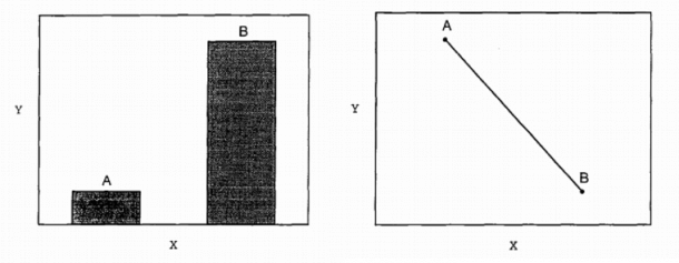
Results: When looking at the bar graph, students used words like more/less, more/fewer, higher/lower and stronger/weaker. These are all terms associated with comparisons. Students who viewed the line graph used words like function, relationship, correlation, and trend, which are all terms associated with continuous change.
In summary, when students saw bars, they described contrasts in the data; when they saw lines, they described trends. This supports the existence of the bar-line convention.
Experiment 2: Real-World Variation
In this experiment, researchers wanted to test the bar-line convention in a real-world scenario. Simple graphs were created with one dependent variable (height) and two independent variables (gender and age). Again, students either saw a version of the graph drawn as a bar graph or a line graph. They were then asked to describe what they saw.
In Experiment 2, researchers were curious to see how students explained graphs that seemed to defy the bar-line convention, like the line graph depicting gender. The charts below are examples of the bar and line graphs shown for this experiment, recreated with Infogram.
Results: Both the graph type and the independent variable effected the viewers’ description of the graphs. Like Experiment 1, students were more likely to use a comparison for a bar graph than for a line graph, and more likely to make a trend assessment for a line graph than a bar graph.
Here is where things get interesting. When looking at the gender line graph, one student explained it as, “the more male a person is, the taller he/she is.” That doesn’t even make sense! The bar-line convention is strong. The fact that some students were willing to evaluate stand-alone data as a trend illustrates the power of the bar-line convention.
Experiment 3: The Author’s Turn
The first two experiments showed that the bar-line convention influences readers’ understanding of a graph. Experiment 3 was designed to see if the creators of graphs were just as sensitive to the bar-line convention as viewers.
Stanford University undergraduates were given a description of a data pattern and asked to draw a graph. The data described and labels provided were the same as they had been in Experiment 2. The descriptions used language that either implied comparisons or continuous trends.
Results: The results of Experiment 3 mirror those of the previous experiments. When given a comparison description, students drew bar graphs. When students were given a continuous description, they drew line graphs. These results show that creators of graphs are just as sensitive to the bar-line convention as readers.
Final Conclusions
While many graphic communication conventions have been invented and reinvented across cultures and centuries, the human brain’s natural ability to understand bars as separate entities ready for comparison, and lines as related continuous trends, remains ingrained.
Stanford’s study of the ‘bar-line convention’ shows why it’s important to follow best practices when designing data visualizations. The type of chart you use is just as relevant as the data you want to share. You don’t want to confuse or mislead your viewer!
Want to learn more about how to make awesome charts and avoid common charting mistakes? Download our free eBook, ‘Chart Do’s and Don’ts: The Ultimate Data Viz Guide.’

Get data visualization tips every week:
New features, special offers, and exciting news about the world of data visualization.