18.01.2016 by Anete Ezera
Data visualizations are a fantastic way to bring information to life. If done well, they make your data more engaging and memorable. But, where do you start? Here are a few basic techniques to look over before you begin.
Choose a Topic
You might already know what story you want to tell with your data. Or, you may be searching for data to turn into an awesome chart, graph, or infographic. Ask yourself these questions when picking a topic for your visualization:
- Who is your target audience and where will they find your visual?
- What is the goal of your visual? What would you like to achieve?
- If you plan to share your visual online, do you want a short term boost in traffic or are you hoping for a longer lifespan?
- What type of data visualization will best suit your data?

Organize your Data
Make sure your spreadsheet is formatted and labeled exactly how you want it. Think about the message you want to share with your data, and get rid of anything that doesn’t help you tell your story. Remove the ‘noise.’ There are several free tools online that help you find, clean, and sort your data. Once you’ve organized your information you are ready to start visualizing.
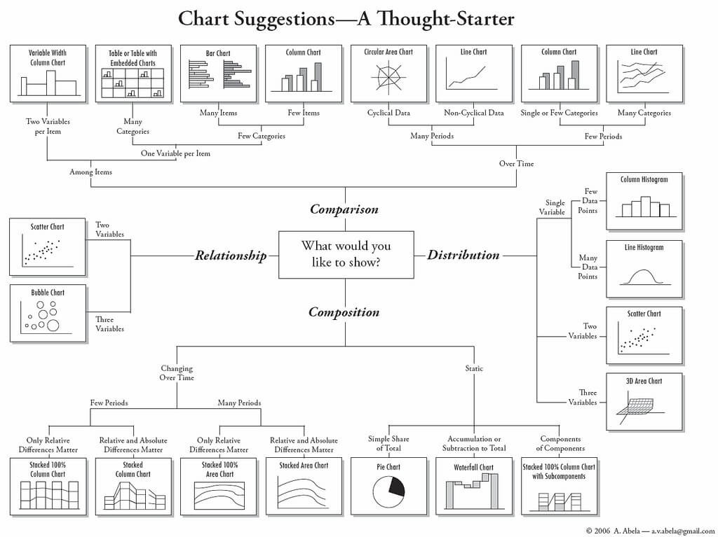
Pick the Right Data Visualization
This can be tricky. While your data might technically work with multiple chart types, you need to pick the one that ensures your message is clear, accurate, and concise. Line, bar, and column charts can represent change over time, pyramids and pie charts show parts-of-a-whole, and scatter plots and treemaps are nice if you have a lot of data. Infographics are great if you have multiple charts and graphs that are related and should be shown together to make a bigger impact.
Make it Look Good
Easier said than done, right? While your data is clearly the most important part of your visual, we can all agree making it look good is also a factor. You don’t need to be a designer to make a polished end product. In fact, online dataviz tools like Infogram make it easy to create beautiful charts and graphs. We’ve selected a few tips to help you design an awesome visual.
Keep it Simple
Unless you know how to design complex data visualizations, our best advice is to keep it simple. Remember that less is more. Don’t use too much text or too many numbers. Avoid grid lines or legends that don’t support your message. A busy visual isn’t fun to look at and often distracts from the data. Dataviz guru Edward Tufte once said, “confusion and clutter are failures of design, not attributes of information.”
Use Color
Using color effectively can enhance the way your charts and graphs communicate data. That being said, color used incorrectly can muddle or confuse the viewer. You can use varying shades of one hue or pick a color palette that suits your message. There are multiple great online color tools for you to use like Adobe’s color wheel and ColorExplorer. If you are preparing visuals for a report or presentation within your organization try to use your brand’s colors for consistency.
Interactivity
Any time you are dealing with charts and graphs online, you have the opportunity to add layers of depth with interactivity. Interactive data visualizations are cool because they allow the viewer to actually interact with the data on their own. You can combine multiple data sets in an engaging way that makes your work more memorable.
Avoid Common Mistakes
Nothing is worse than a poorly crafted or downright deceptive chart or infographic. Dataviz is supposed to make data easier to interpret, not harder. These are some of the most common mistakes you should avoid.
- Correct proportions – Shape and size of elements (bubble charts, pyramids etc) are perceived in relation to each other so make sure they are scaled appropriately.
- Don’t compare two charts that are too similar – You don’t want your viewer to have to think too long or hard about what they are supposed to get from your chart.
- Start origin at 0 – Charts or graphs that don’t place the origin at zero run the risk of confusing your viewer. You mess with the y-axis and you have a visualization that could paint the wrong picture.
- Make sure your data adds up – This may sound obvious, but if you have a pie chart showing percentages, make sure those numbers add up to an even 100.
- Charts with way too much information – Don’t have so many bars on your chart or slices in your pie that the viewer can’t clearly see what is going on.
- Don’t get too flashy – Charts and graphs are built a certain way for a reason; they are the best way to clearly represent data! Resist the urge to add unnecessary text, 3-D imagery or pictures to your visualization and let the data do the talking.
Would you like to experience the full power of data visualization? Try Infogram for Teams or Enterprise for free! With a Team or Enterprise account, you can create up to 10,000+ projects, collaborate with your team in real time, use our engagement analytics feature, and more. Request your free demo here.
Get data visualization tips every week:
New features, special offers, and exciting news about the world of data visualization.