01.10.2015 by roberts
One of the key challenges when writing articles is finding the right data to support and illustrate the story. And, while data lends credibility to any content piece, it is often times left out for lack of time or access to the right data resources. Knowing that this is a big pain point for our users, we’ve written in the past a few articles that describe some of our favorite resources, as well as tools you can use to scrape and analyze data.
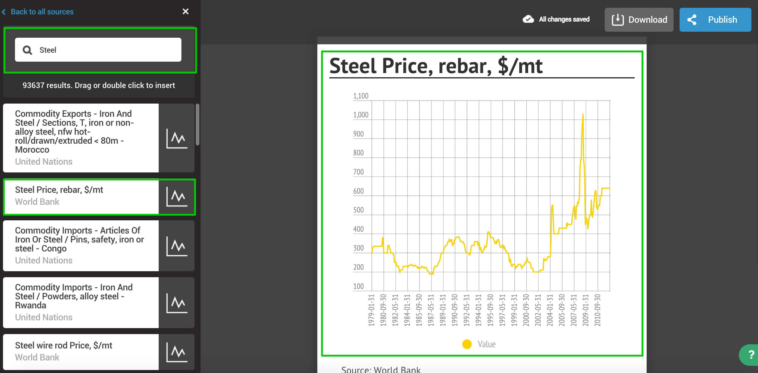
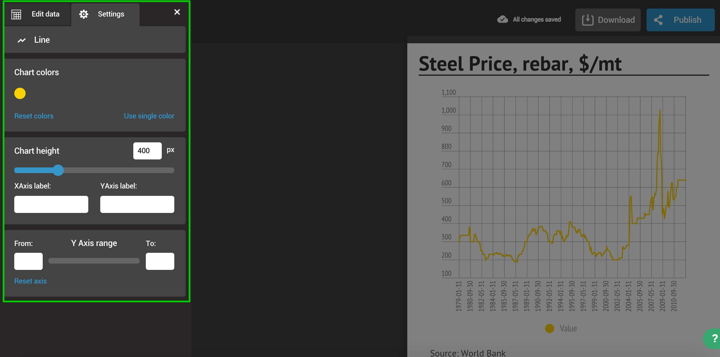
Today we’re taking it one step further. We have integrated into our product over 5 million data tables from the World Bank, UN, Eurostat, WHO, Yahoo Finance, U.S. SEC, FRED and the ECB. You’ll find all kinds of numbers ranging from Country GDPs to stock prices to life expectancy. Simply drag the charts to add data to your template, and double-click to format the graph.
With this new product release we’re making the creation of data-driven content faster, easier and more efficient. As always, you can be sure that charts created with Infogram will be beautiful, responsive and interactive so you can offer your audience the most engaging content experience.
Would you like to experience the full power of data visualization? Try Infogram for Teams or Enterprise for free! With a Team or Enterprise account, you can create up to 10,000+ projects, collaborate with your team in real time, use our engagement analytics feature, and more. Request your free demo here.
To find it:
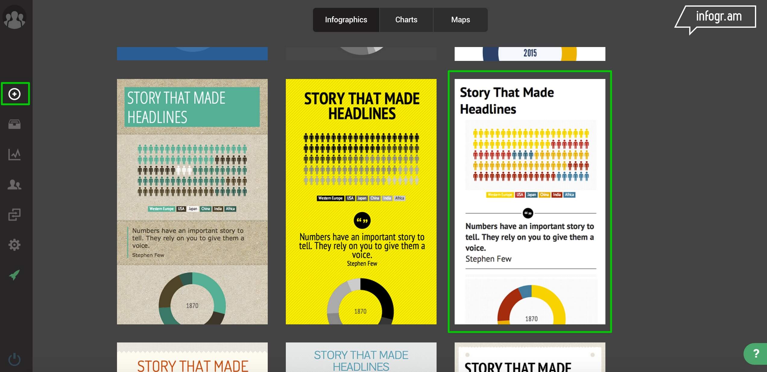
Create a new project using one of our 14 free templates
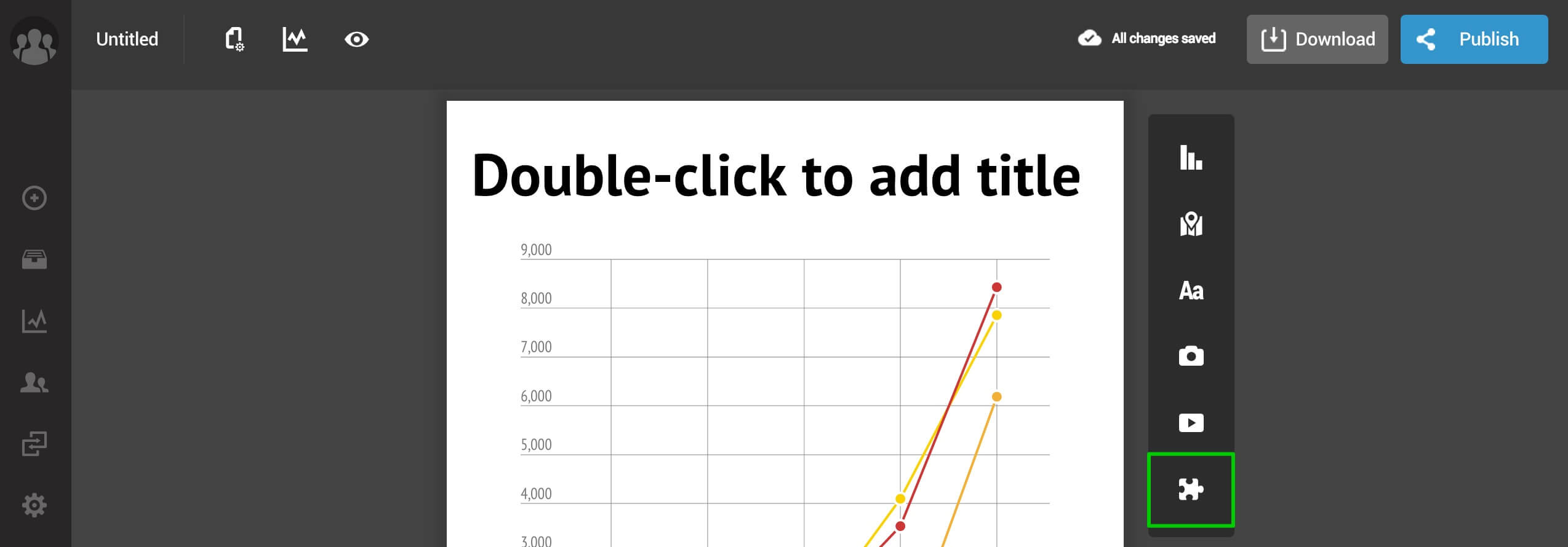
Click on the puzzle icon
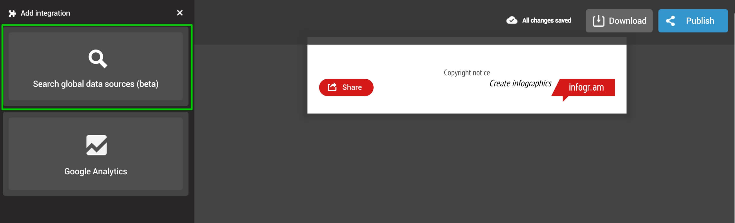
Click on ‘Search global data sources’ and type in your query.
Double-click to insert the chart into your project. We will automatically add a title and the data source.
Open the chart editor to modify the colors, the time range of the data set and the chart height
Enjoy!
Get data visualization tips every week:
New features, special offers, and exciting news about the world of data visualization.