17.08.2016 by Anete Ezera
New article: How to Make an Infographic in 10 Steps [Guide]
‘Data storytelling’ and ‘infographics’ are big buzz words. It makes sense given the fact that infographics have the power to present complex data in a concise, highly visual way. When done right, infographics tell data stories effectively by making information easy to digest.
Would you like to experience the full power of data visualization? Try Infogram for Teams or Enterprise for free! With a Team or Enterprise account, you can create up to 10,000+ projects, collaborate with your team in real time, use our engagement analytics feature, and more. Request your free demo here.
Fun Fact: 90% of information that comes to the brain is visual and infographics are liked and shared on social media 3X more than other any other type of content.
Infographics get a bad reputation for possibly oversimplifying tricky subject matter or even worse – presenting untruths as facts. But, all of this can be avoided if you follow the proper steps when designing a great infographic.
1) Know Your Story
First, you must find a narrative. What story are you trying to tell? Are you trying to simplify a complicated idea, explain a process, highlight trends or make an argument?
Ask yourself these questions when picking a topic for your visualization:
- Who is your target audience and where will they find your visual?
- What is the goal of your visual? What would you like to achieve?
- If you plan to share your visual online, do you want a short term boost in traffic or are you hoping for a longer lifespan?
- What type of data visualization will best suit your data?
- Are you using data? If so, do you have clean data ready to visualize?

2) Gather Clean Data
Data needs to be visualized and analyzed in order to share quality stories and make an impact. The problem is that all datasets are not created equal. Spreadsheets, PDF’s, and non-traditional data sources need to be cleaned up before they can come to life.
Think about the message you want to share with your data and get rid of anything that doesn’t help you tell your story. Remove the ‘noise.’ There are several free tools online that help you find, clean, and sort your data. Once you’ve organized your information you are ready to start visualizing.
3) Write a Powerful, Concise Title
The headline of your infographic is crucial. Boring, vague, uninformative headlines will kill the excitement of your infographic and turn off viewers. Bad titles simply don’t do your work justice.
In fact, researchers at MIT conducted an eye-tracking study to determine how people process infographic information. They found that good headlines are the key to audience retention. They draw your viewer in, explain the journey they are about to go on, and make them curious to learn more.
4) Choose the Right Aesthetic
Don’t forget that designing infographics can be fun! This is where you get to dictate the style of your infographic. Make sure it is appropriate and matches the content you wish to share. Pick colors, fonts, and charts that work together so your infographic appears uniform and professional throughout.
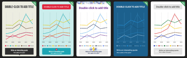
You also need to decide if you’re taking the ‘data’ approach or the ‘graphic’ approach. Some people like highlighting the raw data, with beautiful data visualizations. Others like to make infographics that tell stories with visuals, which aren’t so data heavy.
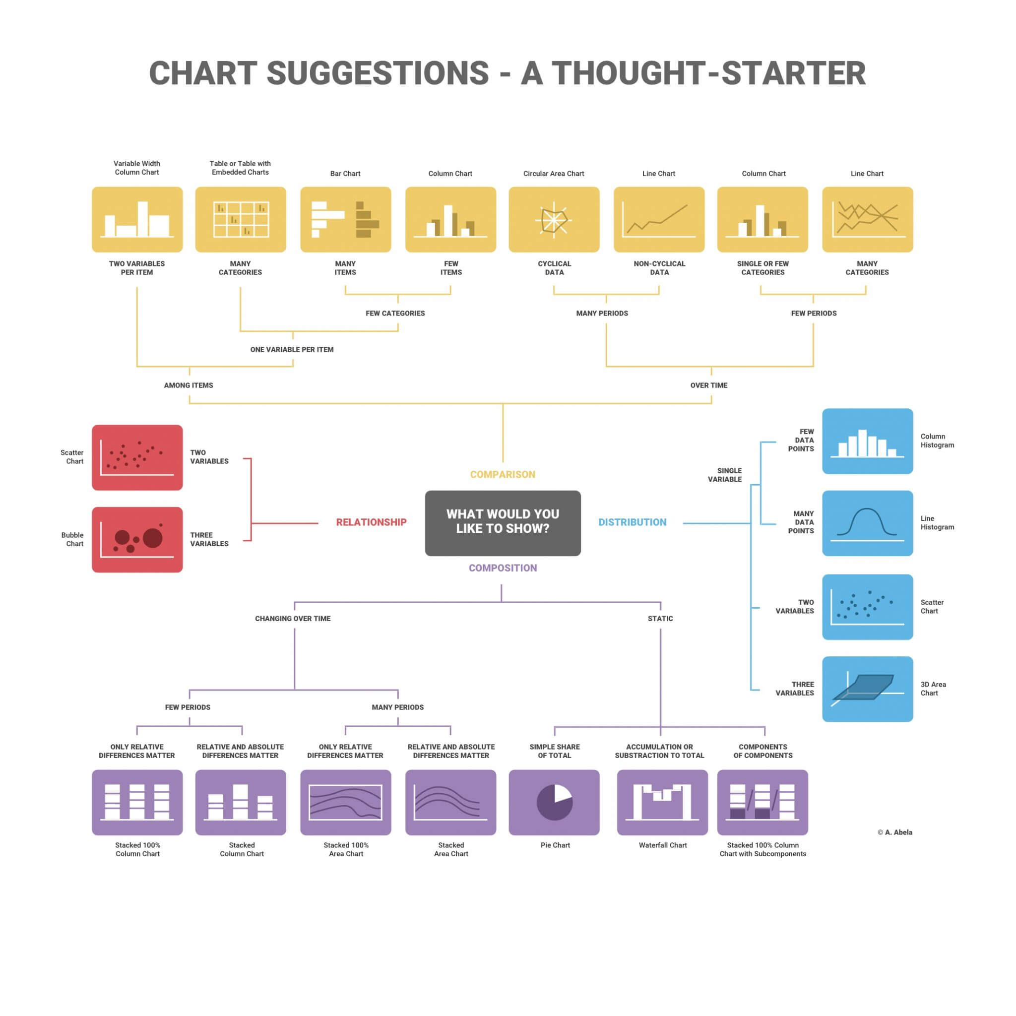
5) Pick the Right Charts
Many infographics rely on statistics. If you have data you want to visualize, make sure you use the right visual format. While your data might work with multiple chart types, it’s up to you to select the one that ensures your message is clear and accurate.
Follow best charting practices. Your numbers need to add up and charts need to be scaled accordingly. If you’d like more tips, download our latest free eBook – ‘The Ultimate Data Visualization Guide.’
6) Keep it Simple
A common mistake made by design newbies is including too much information in one single infographic. Unless you know how to design complex data visualizations, our best advice is to keep it simple. Remember less is more! You don’t want to make your reader work harder than they have to in order to understand your work.
Don’t use too much text or too many numbers. Avoid grid lines or legends that don’t support your message. A busy visual isn’t fun to look at and often distracts from the data. Data visualization guru Edward Tufte once said, “confusion and clutter are failures of design, not attributes of information.”
7) Highlight Your Most Powerful Statistic
Journalists are storytellers, and from day one they are warned not to ‘bury the lead.’ This means you shouldn’t wait to share your most interesting or important information. It’s essentially the backbone of your story.
Lead with your most compelling statistic, determine what supporting data should follow, and work off that hierarchy. Add supporting visuals, stats, and visualizations as necessary.
8) Think About Flow + Structure
Once you have picked the data you want to share and visualized it properly, you need to think about your flow. We suggest you create a wireframe to help plan your visual arrangement. It is important to pick a layout that best showcases your data.
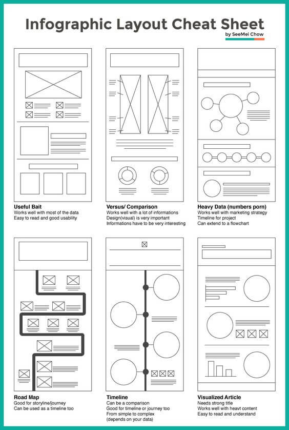
Credit: Piktochart’s SeeMei Chow
9) Refine and Perfect Your Vision
<>Continue to tweak your infographic until the vision is clear and complete. Have your boss, friends, or co-workers look over your work and give feedback. Is it easy to understand? Visually engaging? Worth sharing? Once you’ve determined what isn’t working, go ahead and make edits until you’re happy with the end product. This step may take some time, but it’s worth it.
10) Promote Your Infographic
Now that you have a polished infographic, it’s time to share it! There are many ways to get your infographic in front of a diverse audience. Quick Sprout came up with 5 ways to get your infographic to go viral:
- Submit an SEO optimized press release with a persuasive lead and unique approach.
- Create a social media release.
- Create a social media sharing plan on sites like Twitter and Facebook.
- Submit your infographic to directories like Visualoop and Cool Infographics.
- Start the manual outreach on blogs and Twitter.
Ready to get started? Sign up or log in to Infogram and design an infographic of your own. Pick one of our themed templates, follow steps 1-10 outlined above, and share your work with the world. Want more awesome infographic posts?
- 13 Movie Infographics Simplify Crazy Plot Twists
- How to Design an Infographic Resume That Lands You the Job
- Discover, Pin, and Share Amazing Infographics on Pinterest

Get data visualization tips every week:
New features, special offers, and exciting news about the world of data visualization.