15.07.2015 by roberts
Originally published on Africa Check, a non-profit fact-checking organization; @AfricaCheck.
Sometimes data can tell a story more effectively than word or photos. As a journalist, once you’ve researched and come up with a great data-driven story, you’ll need to present it. This usually involves visualizing the data you’re working with.
Here is a guide that briefly explains some easy-to-use tools to help you get started.
To visualize or not?
The first question you should always ask yourself is whether visualizing your data is really necessary. Would it make the story easier to understand? Does it provide context? Is it relevant?
Including a visualization just for the sake of it can be confusing and reduce the impact of your story. Remember that bad data visualization can be worse than none at all.
When to use what
It’s important to choose the right kind of graph to visualize your data. Below is a brief summary of various types of graphs and when it’s best to use what.
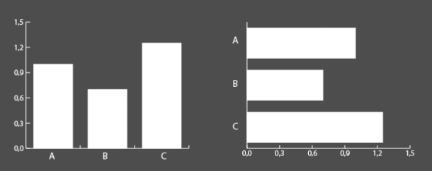
Bar Graphs
Bar charts (or column charts) are great for making comparisons between two or more things. They can also be used to show change over time, but they can be difficult to read if the changes are small.
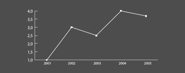
Line Graphs
These are best for showing change over time, particularly if the changes are fairly small and would not be as easy to see if you used a bar chart.
Pie Charts
Pie chart are often misused and some people feel they should not be used at all. A bar chart is a far more understandable way of presenting your data on most occasions. (It’s easier for the human eye to compare the heights of columns than the area of a pie chart.)
However, pie charts are very good for showing parts of a whole. Avoid using pie charts when you have more than two values.

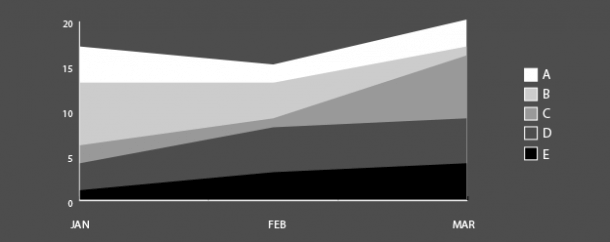
Area Graphs
These are good for showing total change over time when there are several categories or values contributing to a total, for example, if you wanted to show changes in the performance of four different sectors of the economy and of the economy overall, over time.
Scatter Graphs
Scatter graphs, or XY plots, are great for showing relationships or correlations between things. They are also a great way to spot outliers in data.
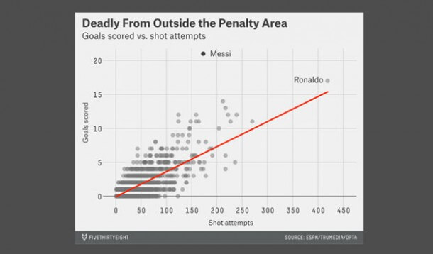
Image sourced from FiveThirtyEight
Tree Maps
Tree maps are a great way to compare things that are in a hierarchy and show the ratios of components.
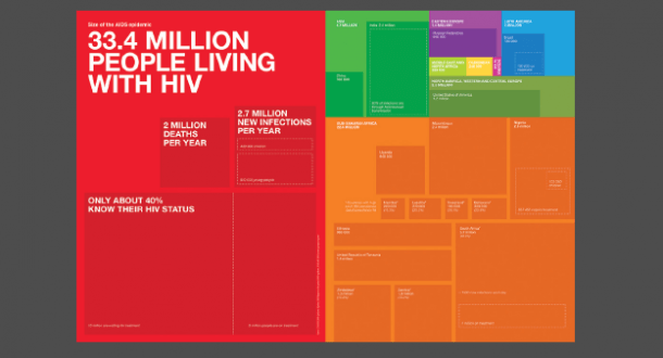
The annual report of UNAIDS, the Joint United Nations Programme on HIV/AIDS, originally published in their Outlook 2010 report.
General tips for creating graphs or charts
Make sure everything is clearly labelled. If people don’t know what is being represented they won’t be able to understand your data.
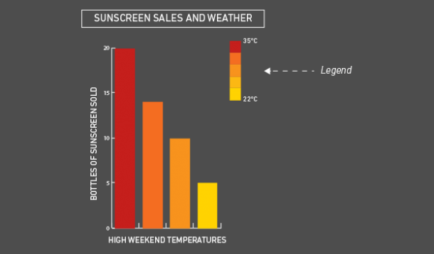
Use a legend if necessary. If you’ve used colors or symbols in your visualization make sure people know what they represent.
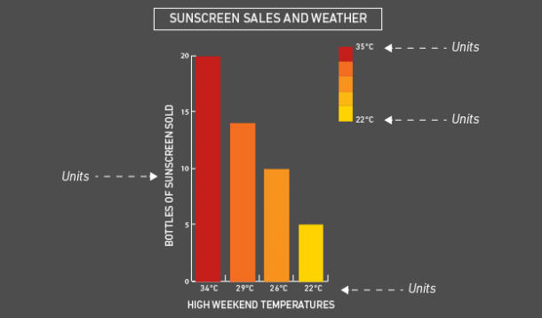
Specify units. Simply having a value of 10 is meaningless unless you know if it’s 10 meters, 10 millimeters or 10 years.
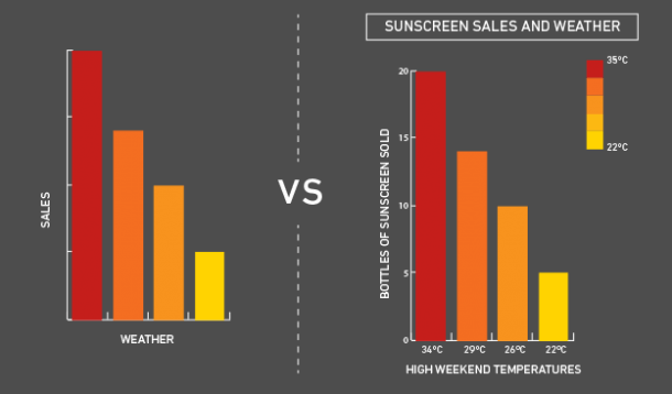
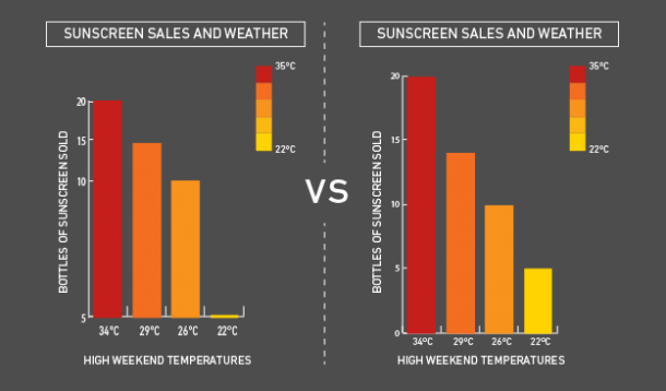
Always start your axis at 0 and use even intervals. Starting at another value or using uneven intervals can make graphs misleading.
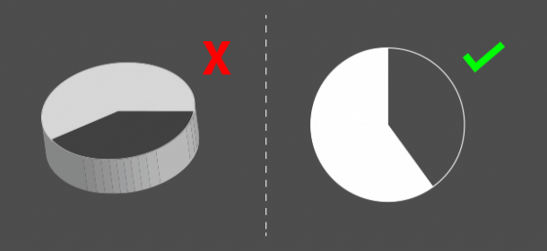
Avoid 3-D and ‘blow-apart’ effects. As tempting as it is and as nice as you might think it looks, this makes it very difficult to visually compare data. A good example of how misleading a 3-D charts can be found here:
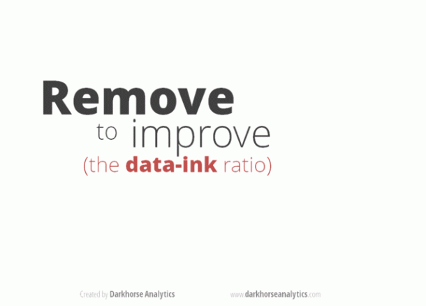
Less is more. Make your visualizations as simple and clean as possible, it makes them much easier to understand and usually more visually appealing. Keep the ‘data to ink ratio’ in mind – if you had to print your visualization try and show as much information as possible using the least ink. Here’s a great animation by Darkhorse Analytics showing this principle at work:
Step-by-step: Creating a basic infographic using Infogram
There are many free online tools for creating infographics that you can embed in your online story. (You’ll find a list at the end of the guide.)
Let’s have a go at creating a graph using the popular tool Infogram:
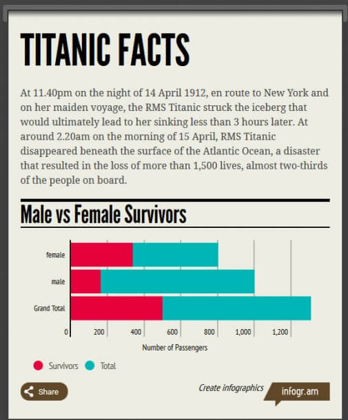
- First you’ll need some nice, clean data to work with. You can use your own or download this practice dataset about the passengers on the Titanic to play with.
- Visit infogram.com and register (it’s free) and login.
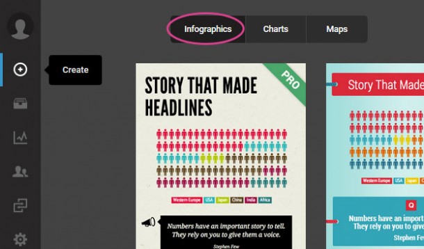
- Click on the “Create” button near the top left.
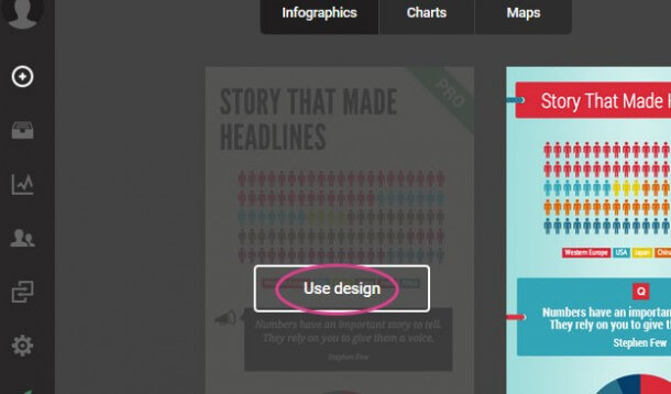
- At the top you’ll see you can create infographics, charts or maps. For this exercise we’ll create an infographic that has some charts as well.
- Choose a template that appeals to you by clicking on it.
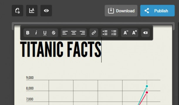
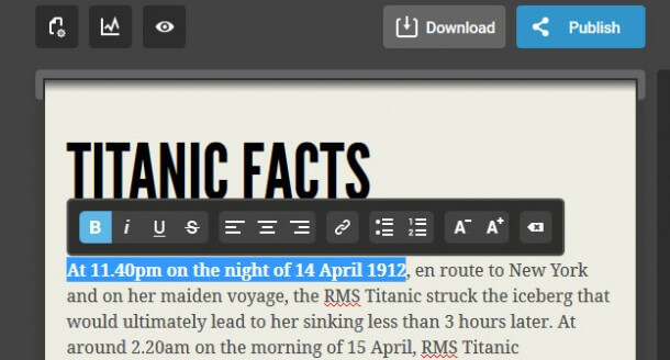
- Double click to add a title. I’m going to call this “Titanic Facts”. You’ll see you can change the font size, alignment, make things bold, etcetera – very much like you would in Microsoft Word or other text editing software. You can also undo changes using the same CMD or CTRL + Z keyboard shortcut.
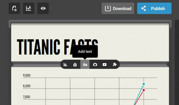
- If you mouseover the space between elements it will show a grey bar with the option to add a chart, map, text, a picture or video. Let’s start with some introductory text, so click on “Add text”.
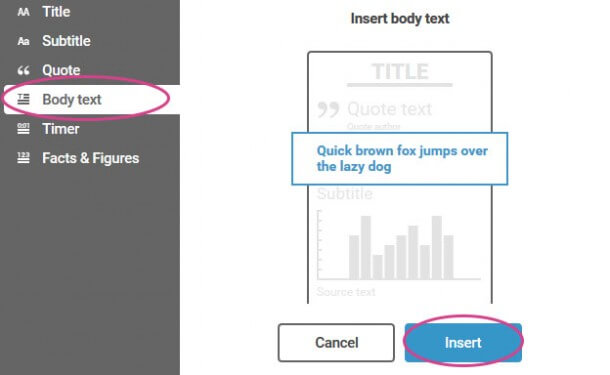
- You can add different types of text – in this case I’m just going to use body text to create an introductory paragraph. Click “Insert”.
- Now you can double click to edit the text element we’ve inserted and type and format some introductory text.
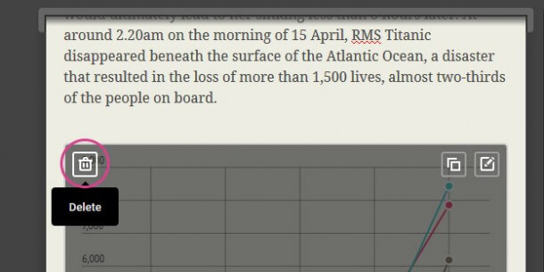
- You can also delete and duplicate elements. Let’s delete the default graph and text below it.
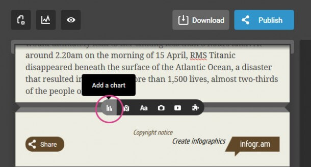
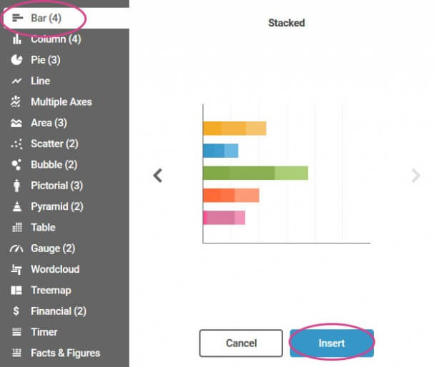
- Let’s add a chart. I want to show the difference in survival rates of male and female passengers from the practice dataset, so I’ll use a stacked bar chart.
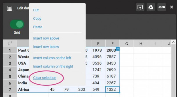
- You’ll see a dummy chart has been added. Double click to edit it and delete all of the existing data so we can insert our own by dragging to select it all, right-clicking and then selecting “Clear Selection.”
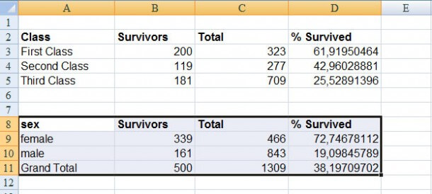
- Open the Titanic dataset, or your own. In the sheet labelled “data for infogram” you’ll see a table with data on male and female passengers. Copy this (CMD/CTRL + C). Note how these tables have been tidied up and labelled in the way we want them to appear on our chart.
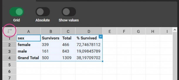
- You’ll see that the chart is updated, but it’s the wrong way round! We can fix this by transposing the data – swapping the columns and rows around by clicking on the transpose button at the top left.
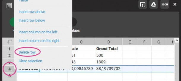
- Including the percentage that survived on this graph does not make sense – the other values are in units of people, so you can’t directly compare it to a percentage. It will be better to include this separately, so let’s delete this row by right clicking on the row number to the left and selecting “Delete row”.
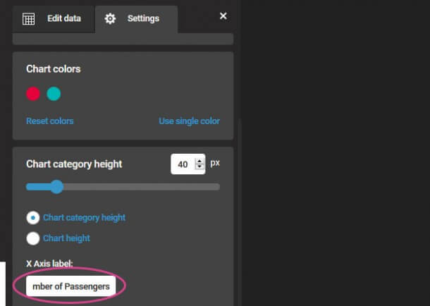
- We can customize the chart by clicking on the “Settings” tab. Here you can edit the colors, the size and add a label for the X-axis (the horizontal one). It’s important to specify what your numbers represent, so let’s label it “Number of Passengers”.
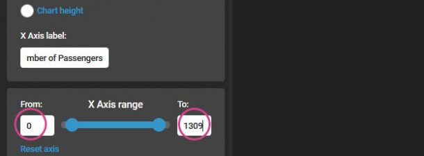
- We should also make sure our X-axis has the correct range. We know from our data that the total number of passengers is 1309, so “0” and “1309”.
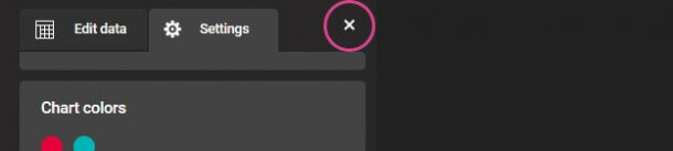
- When you’re done customizing your chart, click the close button at the top right (or anywhere not in the editing menu).
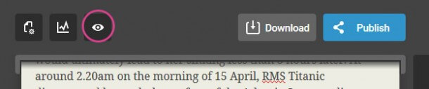
- You can preview your infographic by clicking on the eye icon at the top. You’ll see that if you mouseover your chart the numbers are displayed. You can continue adding elements – play around with the different charts and options!
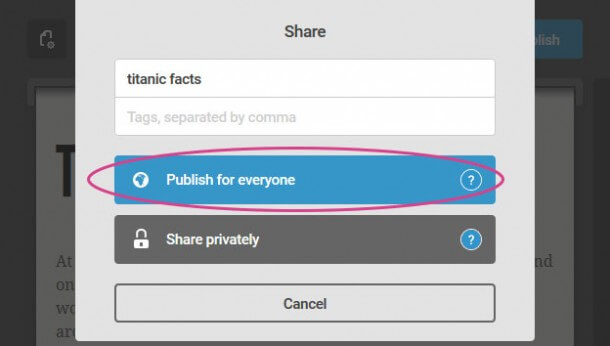
- When you’re done you can publish your infographic by clicking on the “Publish” button. You can change the title and add some tags. If you want to embed it in a news story you’ll need to publish it for everyone so people can view it.

- Now you are given a direct link to your infographic that you can share with people as well as the embed code that you can use to insert it into another webpage. You can copy and paste this code into another website to embed the infographic, for example into a blog post.
- Here you go!
More visualization tools
I’d encourage you to explore more tools on your own. Below is a list of useful resources for continuing on your data journalism journey. Enjoy!
Visualizing Data for Advocacy
This is a great book about how advocates and activists have used visual elements in their campaigns and explores how to influence issues using the right combination of information, design, technologies and networks. You can download a free PDF e-book or order a physical copy.
https://visualisingadvocacy.org/getbook
Visualization Tools
A comprehensive list of recommended data visualization tools based on what you’d like to do with them.
https://visualisingadvocacy.org/resources/visualisationtools
Would you like to experience the full power of data visualization? Try Infogram for Teams or Enterprise for free! With a Team or Enterprise account, you can create up to 10,000+ projects, collaborate with your team in real time, use our engagement analytics feature, and more. Request your free demo here.
Get data visualization tips every week:
New features, special offers, and exciting news about the world of data visualization.