05.01.2016 by Anete Ezera
We all have a basic understanding of how line and column charts work. They do a great job of visualizing time-series data and are helpful when making size comparisons. But, what happens when you want to compare two variables with different magnitudes and scales of measurement, in hopes of proving or disproving a trend? The answer is the dual axis (multiple axes) chart.
With a dual axis chart you are essentially combining multiple charts and adding a second y-axis for comparison. Some members of the data visualization community are skeptical about the use of dual axis charts because they can often be confusing, poorly designed, and misleading to the viewer.
However, if you have limited space and want to quickly establish the relationship between two variables, the dual axis chart might be the right fit for you. Let’s go over the different types of dual axis charts and the best ways to use them.
Types of Dual Axis Charts
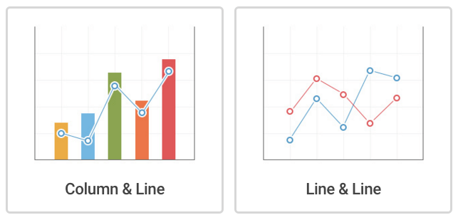
Column and Line Chart – This dual axis chart combines a column chart with a line chart.
Dual Line Chart – This dual axis chart compares two line charts. There can be more than two lines if need be.
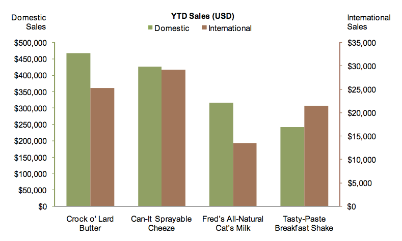
Dual Column Chart – This dual axis column chart shows two sets of data displayed side by side.
Stephen Few – Perceptual Edge, 2008
Multiple Axes Chart – This displays the most complex version of the dual axis chart. Here you see three sets of data – with three y-axes.
Best Practices
DO
- Make sure your y-axes are related – Dual axis charts can be useful when comparing values that have different units of measure, because the things they measure are somehow related in a meaningful way. So make sure both axes are helping you tell your story effectively.
- Place primary y-axis on the left – We are hard-wired to look at the y-axis on the left first. Make sure your more important variable is placed there.
- Use contrasting colors – Color code your dual axis chart to make it easier for people to understand the data sets you have plotted. Try using contrasting colors so they are easy to distinguish from one another.
DON’T
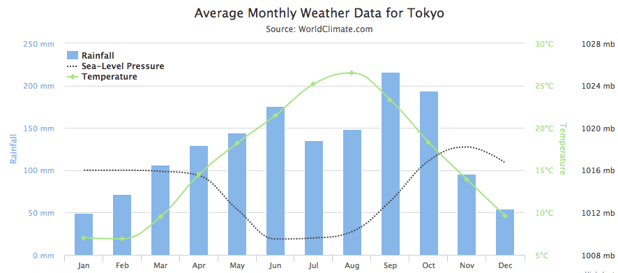
- Compare similar units of measurement – Take this opportunity to show you’ve done your research and give diversity to your data. For example, you can use a dual axis chart to compare revenue and units sold, price and volume, or rainfall and temperature. If you use similar units of measurement (i.e. monetary values), make sure both y-axes are scaled differently.
- Include too many variables – Using multiple lines for your dual axis chart is considered acceptable, although it does run the risk of getting cluttered. We suggest you don’t compare more than four variables when creating a dual axis chart.
We hope you have a better understanding of just what dual axis charts are and the best way to use them. You can create multiple dual axis charts with Infogram! Click below to get started.

Get data visualization tips every week:
New features, special offers, and exciting news about the world of data visualization.