10.05.2016 by Anete Ezera
Presenting data doesn’t need to be boring. In fact, it is a great way to spice up your presentations and share important facts and figures with your audience. Data has the power to be engaging, persuasive and memorable.
If you have a compelling story to tell with data, you should present it in a clear and powerful way. We will help you get started with a few effective data presentation techniques!
If you’d like more information about designing great presentations, download our new eBook ‘How to Design PowerPoint Presentations that Pack a Punch in 5 Easy Steps.’

What Presentations Benefit from Data?
Data doesn’t necessarily make all presentations better, but certain types of presentations are prime for the incorporation of data visualizations:
- Sales Reports
- PR and Marketing Research
- Marketing and Advertising Campaigns
- Executive and CEO Presentations
- Educational Reports
- Political Speeches
- Annual Reports
- Shareholder Presentations
- Financial Reports
- Product Launches, and more!
Why Use Charts in Presentations?
Visuals make information stick in our brains. A study from the Wharton School of Business found that 67% of the audience surveyed were persuaded by verbal presentations that had accompanying visuals. Charts are great visual aids for multiple reasons:
- Charts are easy to read
- Charts are visually appealing
- Charts simplify complex information
- Charts make it possible to quickly make comparisons and spot trends
- Charts are memorable and make an impact
- Charts give your presentation credibility
How to Add Data to Your Presentation
1) Define Your Message
Before you can even think about adding data to your presentation, you need to ask yourself, ‘what story am I trying to tell?’ Once you have a concrete idea of what your message is, you’ll have an easier time crafting the right visualization to share with your audience.
2) Clean and Organize Your Data
Now that you know what point you want to make with your data, it’s time to make sure your numbers are ready to be visualized. Every good data visualization starts with good data. Make sure your spreadsheet is formatted and labeled exactly how you want it. Think about the message you want to share with your data and get rid of anything that doesn’t help you tell your story.
Data that is clean and organized is easier to display and analyze. Here are five awesome free data analysis tools to help you extract, clean, and share your data.
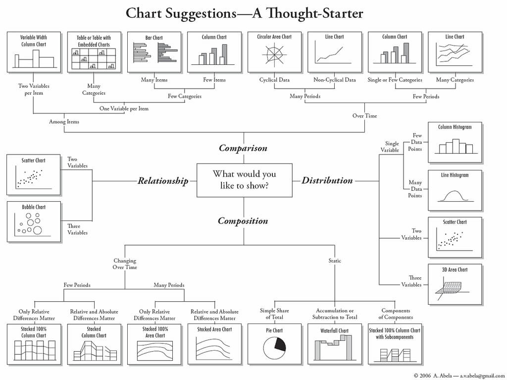
3) Pick the Right Chart Type
We can’t emphasize enough how important it is to make sure you pick the right chart type for the data you want to present. While your data might technically work with multiple chart types, you need to pick the one that ensures your message is clear, accurate, and concise.
4) Simplicity is Key
Charts and graphs turn complex ideas or data sets into easy-to-understand visual concepts. Remember that your data is the star of the show, so keep it simple. Avoid visual clutter, excessive text, poor color selection, and unnecessary animations. Make sure your legend and data labels are printed in a large, visible font. You don’t want your audience to get distracted. Less is more!
5) Create a Narrative
People understand stories better than they understand spreadsheets. Craft a compelling story around your data to make it memorable. Find a way to drive emotion from the numbers. Give your audience something they can relate to and resonate with. Data visualization speaker Bill Shander offers five tips to make you a better data storyteller.
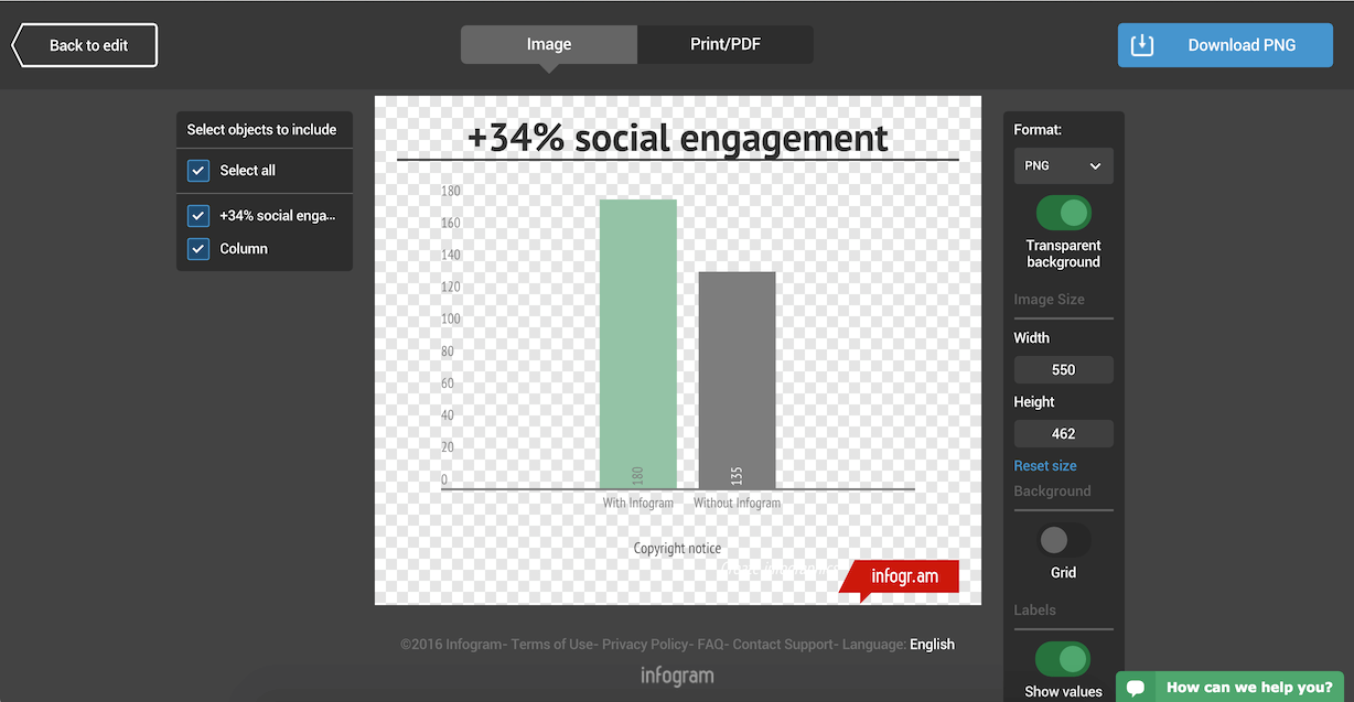
6) Visualize Data with Infogram
Before you add data to your presentation you need to visualize it. While many presentation tools allow you to create charts, they often leave much to be desired. Infogram makes it easy to create beautiful, engaging data visualizations your audience won’t forget.
You can embed interactive and responsive data visualizations into your presentations if you’re using Bunkr or any other HTML based presentation platform. Or, if you upgrade to one of our paid plans, you can download static versions of your charts and graphs to enhance your work. You can even make the background of PNG downloads transparent so they slip seamlessly into your presentation.
Would you like to experience the full power of data visualization? Try Infogram for Teams or Enterprise for free! With a Team or Enterprise account, you can create up to 10,000+ projects, collaborate with your team in real time, use our engagement analytics feature, and more. Request your free demo here.
7) Make a Handout
Leave your audience with a physical or virtual copy of your charts. This makes it possible for them to look at the numbers more closely after your presentation. It’s also nice to include extra information, beyond what you covered, in case someone wants to delve deeper into the material.
Now that you know how to add data to your presentations, it’s time to learn how to design a PowerPoint that really gets people talking. Download our latest eBook ‘How to Design PowerPoint Presentations that Pack a Punch in 5 Easy Steps’ – for free!
Get data visualization tips every week:
New features, special offers, and exciting news about the world of data visualization.