03.05.2016 by Anete Ezera
We see data visualizations every day in newspaper articles, advertisements, sports broadcasts, reports, and office presentations. They help us make sense of data in a way that is visual and practical. Even though they have become a part of our daily lives, the fact is data visualizations also have the power to enlighten, educate, and inspire.
We’ve selected 8 inspiring data visualizations to get you through the work day:
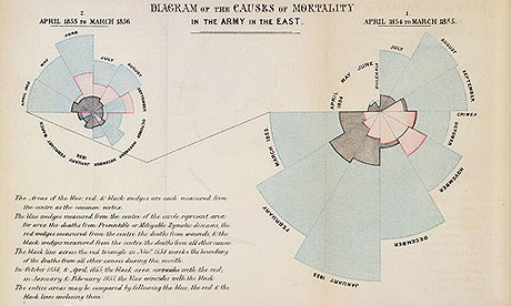
1) Florence Nightingale’s Coxcomb Diagrams
Data visualizations are common, but it’s important to remember where it all started. Florence Nightingale is famous for her work as a nurse during the Crimean War, but she was also a data journalist.
She realized soldiers were dying from poor sanitation and malnutrition, so she kept meticulous records of the death tolls in the hospitals and visualized the data. Her ‘coxcomb’ diagrams helped her fight for better hospital conditions and ultimately save lives. Click here for an interactive version of her famous diagrams.
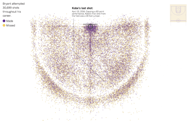
2) Every Shot Kobe Bryant Ever Took
Basketball legend Kobe Bryant recently retired after 20 years playing for the Lakers. During his time with the Lakers, he fired up more than 30,000 shots, including the regular season and playoffs.
In honor of his departure from the NBA, the Los Angeles Times created an incredible visualization showing every shot Kobe Bryant ever took. All 30,699 of them. The yellow dots represent shots Kobe missed, but more importantly, the purple dots show the shots he made over his career.
3) FGV Dengue Fever Study
Dengue fever is a painful, debilitating mosquito-borne disease caused by any one of four closely related dengue viruses. An estimated 390 million dengue infections occur worldwide each year, with about 96 million resulting in illness. A research team from Brazilian think tank FGV’s Department of Public Policy Analysis (FGV/DAPP) made it their mission to create a dengue panorama of Brazil using data visualizations created with Infogram.
The results of their hard work gained them media coverage and international attention. With their data visualizations, they were able to shed new light on the dengue fever epidemic and reveal unknown areas that needed further research.

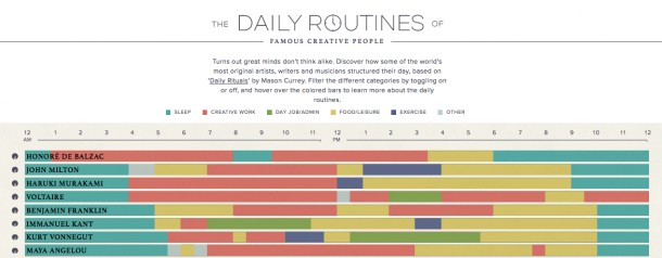
4) Daily Routines of Famous Creative People
Discover how some of the world’s most original artists, writers, and musicians structured their day, based on ‘Daily Rituals’ by Mason Currey. Click the image below for the full interactive infographic.
You can filter the different categories by toggling on or off, and hover over the colored bars to learn more about the daily routines. See how often the most creative minds go for walks, sleep, exercise, eat and feel inspired.
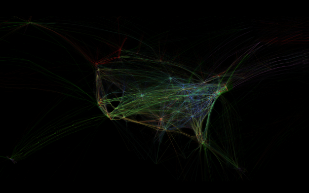
5) Flight Patterns
Aaron Koblin is an artist specializing in data and digital technologies. He believes data can make us more human. He is famous for his project ‘Flight Patterns’ which visualizes every airline flight over North America in a 24-hour period. What’s amazing about this animation is it reveals surprising patterns in flight behavior.
From the visualization animation on Koblin’s website, you can spot time zone changes, holiday celebrations, major cities, and high-traffic airports. Further flight studies including altitude and aircraft type can be found here.
6) John Snow’s Cholera Map
In 1854, a cholera epidemic spread quickly through Soho in London. The Broad Street area had seen over 600 dead, and the remaining residents and business owners had largely fled the terrible disease. Cholera was terrifying, especially since people weren’t sure how it spread.
Physician John Snow plotted the locations of cholera deaths on a map. The surviving maps of his work show a method of tallying the death counts, drawn as lines parallel to the street, at the appropriate addresses. Snow’s research revealed a pattern. He saw a clear concentration around the water pump on Broad Street, helping to find the cause of the infection.

7) Running the Numbers
Artist Chris Jordan’s work is about the behaviors we all engage in unconsciously, on a collective level. He makes large-format, long-zoom artwork from the most mind-blowing data about our daily lives.
His collection is called ‘Running the Numbers,’ and it depicts real world stats with eye-opening artistic flare. The image below shows 9,960 mail order catalogs, equal to the average number of pieces of junk mail that are printed, shipped, delivered, and disposed of in the US every three seconds.

8) Google’s Music Timeline
Nothing inspires quite like the power of music. Google’s amazing interactive music timeline shows the popularity of certain genres of music over time.
You can highlight specific sections of the area chart for detailed information on artists in that category, search for albums or artists to see where they fall, and explore the relationships between different artists in your favorite genre over the decades.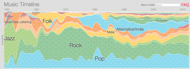
Now that you’ve found your inspiration it’s time to create beautiful data visualizations of your own! Infogram has over 35+ chart types for you to design, publish and share.

Get data visualization tips every week:
New features, special offers, and exciting news about the world of data visualization.