08.12.2015 by Anete Ezera
We spend a lot of time looking at charts, graphs, and infographics online here at Infogram. Lucky for us, there are a bunch of wonderful blogs dedicated to data visualization and data storytelling. Here is a list of the 8 blogs and websites we love to visit, and you should too!
Visualoop
Why we love them:
Visualoop is a part of the Infogram family, so they definitely share our passion for visualizing data! Founded by Tiago Veloso, Visualoop showcases some of the world’s best infographics and data visualizations. They recently won the Bronze award in the Dataviz Website category at the fourth Information is Beautiful Awards.
Top Post:
A comprehensive visualization of the air-traffic lane system over the North Atlantic, created by John Grimwade.
Cool Infographics
Why we love them:
The name says it all. Randy Krum’s popular blog Cool Infographics knows how to have fun with data. It highlights some of the best examples of data visualizations and infographics found in magazines, newspapers and on the Internet.
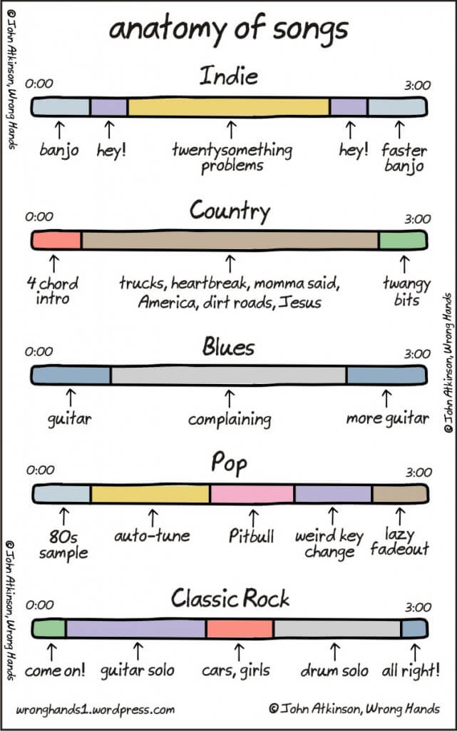
Top Post:
These stacked bar charts, designed by cartoonist John Atkinson, are great visualizations of timelines for songs.
Visualising Data
Why we love them:
Visualising Data is a fantastic website featuring news about data visualization projects, contemporary techniques, and the increasing popularity of data visualization. The site is managed and edited by data visualization specialist Andy Kirk. They took top honors in the best Dataviz Website category at this year’s Information is Beautiful Awards.
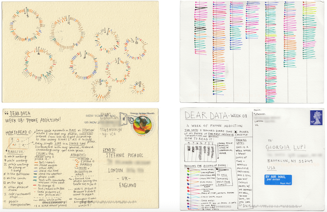
Top Post:
Visualising Data created a quick profile on Dear Data, a lovely ‘artisan visualisation’ concept from the brains and pens of Giorgia Lupi and Stefanie Posavec.
It’s Infographics
Why we love them:
It’s Infographics updates their site multiple times a day, filling your life with tons of informative infographics. This also makes them really fun to follow on social media! They have more than ten categories so you can always find what interests you.
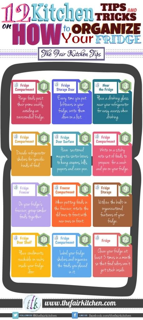
Top Post:
Need help organizing your fridge? There is an infographic for that!
Flowing Data
Why we love them:
Flowing Data is the brainchild of Nathan Yau, a statistician with a specialty in visualization. It explores how statisticians, designers, and data scientists use analysis and visualization to make sense of the world. He has also written a few books, so he knows his stuff!
Top Post:
Are you planning on taking a road trip across the country and want to make sure you’ve sipped the best beer in the country? Look no further than this awesome map showing you the top breweries in the United States, routed algorithmically. Cheers!

Five Thirty Eight
Why we love them:
Founded by well-known analyst Nate Silver, FiveThirtyEight shot to fame aggregating political polls and now features data-heavy stories on a range of topics from science to economics.
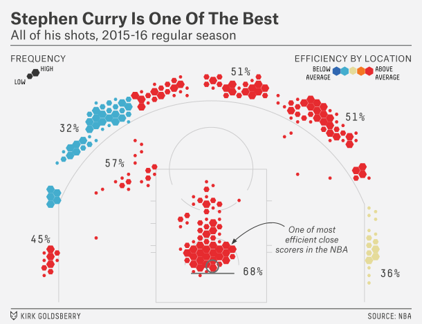
Top Post:
The Warriors’ Stephen Curry is pretty amazing. Here’s Kirk Goldsberry’s shot chart for Curry this season (as of last week).
Reddit – Data is Beautiful feed
Why we love them:
One of the leading subreddits for the dataviz community, r/dataisbeautiful is a place for discovery and discussion of visual representations of data: Graphs, charts, maps, etc. Plus, we love that readers vote their favorite visuals to the top!
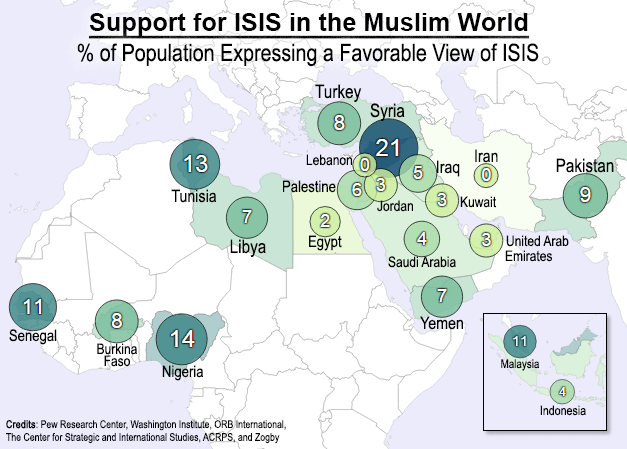
Top Post:
The figures in the map below come from surveys conducted by six different research organizations, covering a combined 20 countries in the Muslim world.
The Guardian
Why we love them:
The Guardian brings their high level of journalistic standards to the world of data visualization. The Guardian Datablog consists of raw data, data visualizations from around the web and Guardian graphic artists, and tools for exploring data. Every day they use Google spreadsheets to share the data behind their in-depth articles.
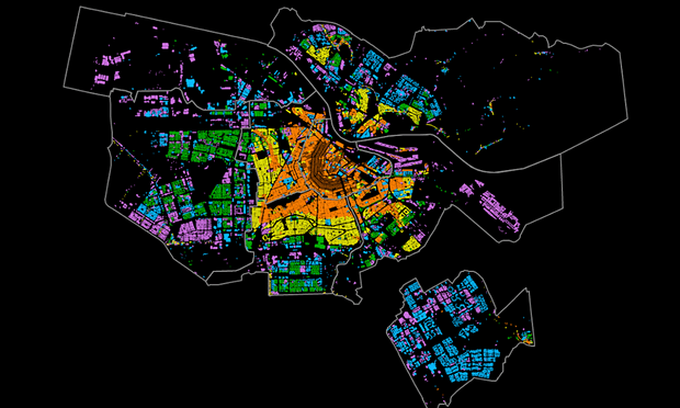
Top Post:
A close look at Amsterdam. Diverse map collection highlights fascinating information about Dutch capital, from areas attacked in second world war to development of its canals.
Get data visualization tips every week:
New features, special offers, and exciting news about the world of data visualization.