15.12.2016 by Anete Ezera
We are constantly impressed with the charts and maps our users create. We happen to have a pretty powerful and versatile mapping tool, which is why we love seeing it in action. With over 500 maps to choose from and a wide variety of design options, you can map just about anything with total creative control.
Would you like to experience the full power of data visualization? Try Infogram for Teams or Enterprise for free! With a Team or Enterprise account, you can create up to 10,000+ projects, collaborate with your team in real time, use our engagement analytics feature, and more. Request your free demo here.
Maps are a great way to visualize geographical data – highlighting locations, patterns, distribution, proportions, and movement. We’ve selected 8 awesome maps made with Infogram to show you what you can create:
1) Median hourly wages in the EU – euronews
2) Hurricane Matthew – MSN
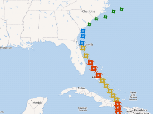
Click the image for the interactive version.
3) Class profile nationalities – University of Cambridge
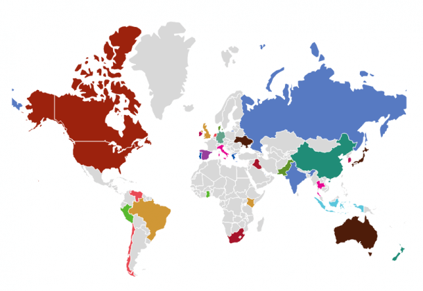
Click the image for the interactive version.
4) Election forecast – Megan Banta
5) Olympic gold medals – Infogram
6) Road deaths across Europe – ETSC
7) Broadband coverage gaps – John Lauer
8) Sales in countries in scope – Access to Medicine Index
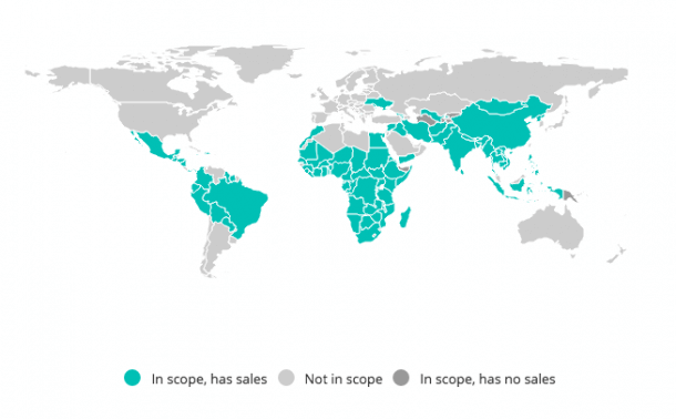
Click the image for the interactive version.
Now that you’ve seen what our mapping tool can do, it’s time to make a map of your own! Sign up or log in to Infogram and explore our map options for yourself. You’ll be visualizing geographical data like a pro in no time.
Get data visualization tips every week:
New features, special offers, and exciting news about the world of data visualization.