14.12.2016 by Anete Ezera
Members of the Infogram team had the opportunity to sit in on Edward Tufte’s ‘Presenting Data and Information’ course this week. We were excited to hear from the statistician and Yale professor who some consider to be the ‘godfather’ of data visualization. He went over best practices, industry insights, and data tools using clever visuals and videos – with the aid of his four classic books.
Here are 5 key takeaways from the world-famous data visualization expert:
1) Your audience is smart
Your audience is intelligent. There is no need to dumb down data content to appeal to the ‘higher ups’ or the general public. Using examples from the National Weather Service and ESPN, Tufte proved that people can handle numbers. Not only that, they seek them out on a daily basis.
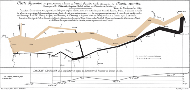
2) Minard was brilliant
This classic Charles Joseph Minard visualization depicting soldiers deaths during Napoleon’s disastrous Russian campaign of 1812 is famous – and for good reason. Minard manages to share 6 different factors, all in two-dimensions. Here he visualized the number of Napoleon’s troops; distance; temperature; the latitude and longitude; direction of travel; and location relative to specific dates.
Tufte claims the design is ‘brilliant.’ Minard provided his credentials, gave text to provide context, and told an epic story. One fun fact Tufte noted? You don’t see the mention of Napoleon anywhere in the graphic. It is all about the soldiers.
3) Google Maps rules all
Google Maps is the most viewed data visualization in the world. It is also beautifully crafted in great detail with layers of complexity. You can view specific streets, major highways, neighborhoods, satellite images, and color coded regions. It’s intense, but it isn’t cluttered or confusing, making the design genius.
4) Tufte loves linking lines
Tufte thinks linking lines are the best. Using examples from Disney, CERN, and the SARS epidemic, Tufte showed how linking lines offer profound information and logical connections. They are essentially verbs, showing how one thing leads to another. Tufte loves linking lines so much he wrote a whole chapter about them in his book Beautiful Evidence.

5) Your visual is for the viewer, not you
It’s easy to get caught up when crafting a visual. But, you need to remember that it isn’t for you – it’s for the person who is going to view it. Bullets on a PowerPoint slide are more useful for the presenter than they are for the person sitting in the audience. Try to craft visuals that are engaging and enlightening, with the viewer in mind.
Also worth noting, don’t overcomplicate things. Avoid flashy visuals, rainbows, unnecessary text, crazy icons, and what Tufte has labeled ‘chart junk.’ If it doesn’t add to your story and ultimately distracts from your data, leave it out. As Tufte said, “there is a lot you can do with data visualizations, you just shouldn’t do it all at once.”
If you love data visualization and want more fun posts like this, sign up for our weekly newsletter. You’ll have the latest tips, tricks, and trends delivered to your inbox weekly.
Get data visualization tips every week:
New features, special offers, and exciting news about the world of data visualization.