27.04.2016 by Anete Ezera
It can be hard to reach consumers in today’s tech-savvy world. They are tired of traditional advertising gimmicks and feel constantly bombarded by online and mobile ads. Consumers are more educated than before and also more weary. The result is that marketers are adapting and starting to use data visualizations to engage their audience and drive their brand strategy.
We’ve selected four examples of companies successfully utilizing Infogram charts in their marketing efforts online:
Shazam
Music app Shazam released an interactive Infogram map on USA Today showing the most Shazamed artists country-by-country last year – and Ed Sheeran ruled in 2015.
Sheeran was the most-Shazamed artist in 47 different countries including Brazil, Chile, Germany, Indonesia, Mexico, and Spain. Close behind were The Weeknd (tops in the U.S. and 20 other countries) and Major Lazer Feat. MØ & DJ Snake (No. 1 in the Honduras and 20 other countries).
“Infogram helps bring data to life! The interactivity and custom Shazam branding within Infogram help to make our infographics engaging and ready to push out in a polished format,” explained Brooke Stevens, Senior Research Manager at Shazam.
Shazam’s map is excellent because it’s interactive, eye-catching, easy to share, and branded. Infogram charts are easy to embed online, which means digital journalists can quickly copy and paste them into their articles, adding depth to their work. Chances are this map also kept people on USA Today longer, engaging with more content on their site, which doesn’t hurt either.
Would you like to experience the full power of data visualization? Try Infogram for Teams or Enterprise for free! With a Team or Enterprise account, you can create up to 10,000+ projects, collaborate with your team in real time, use our engagement analytics feature, and more. Request your free demo here.
Experian: A world of insight
Experian is considered a leading global information services company, providing data and analytical tools to clients around the world. They help businesses manage credit risk, prevent fraud, target marketing offers and automate decision making. Data is clearly key to their success.
Experian’s products and services comparison table proves that sometimes a table is the best way to visualize your data. Click the image below to view the full Infogram table on Experian’s website.
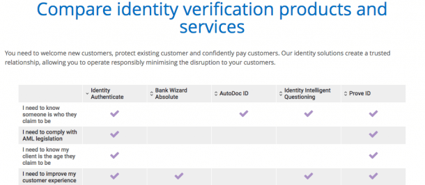
Their table is interactive, which means you can click on the column you’d like to explore and single out specific features that matter to you. Tables are great for organizing related data sets. Plus, tables have been around for centuries, which means most people can easily recognize and read them.
Skyscanner
Global travel site Skyscanner created an interactive map with ideas for a full 12 months of trips. Find out where to go for the best beaches, the best city breaks and the best events in each month of the year with this travel calendar for 2016.
Skyscanner’s Infogram map utilizes the ‘points’ function so you can highlight particular cities you want to travel to. The color coded legend helps you see the coolest city (blue), beach (gold), and event spots (green) around the world for each month of the year! This is a great way for Skyscanner to excite and educate their visitors.
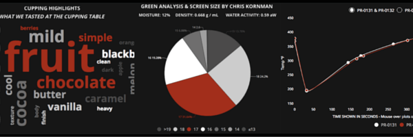
Royal Coffee
Coffee drinkers are very particular about how they like their coffee, which is why Royal Coffee delivers data-driven visuals to help them find the perfect brew. In this article, Royal focuses on one particular organic Guatemalan bean – providing brew duration, water ratios, tasting notes, and more.
Click the image below to view the full article on Royal Coffee’s website, which includes five different Infogram chart types! See how Royal designed their coffee-loving pie chart, line chart, word cloud, table, and scatter plot.
We hope these examples inspired you to come up with new and exciting ways to use data visualizations in your marketing and PR materials. If you want to know more about how Infogram’s charts and graphs can positively impact your business, schedule a meeting with a member of our team.

Get data visualization tips every week:
New features, special offers, and exciting news about the world of data visualization.