26.11.2015 by Anete Ezera
There are few fields of study today that don’t make use of statistical charts. What people may not know is that one man is responsible for most of the charts we use everyday. A Scottish engineer and political economist by the name of William Playfair is credited with having invented the pie chart, bar chart, line chart, and also area charts. He felt charts communicated better than tables of data – and we agree with him!
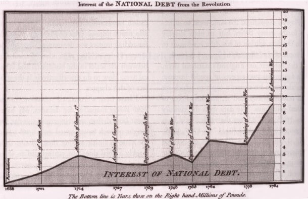
Playfair’s “Commercial and Political Atlas of 1786” featured the first area chart
Today we are going to focus on the bold impact of area charts. Area charts are a lot like line charts, with a few subtle differences. They can both show change over time, overall trends, and continuity across a dataset. While area charts may function the same way as line charts, the space between the line and axis is filled in, indicating volume.
The question is, what are the different types of area charts and how do you use them effectively?
Types of Area Charts
Standard
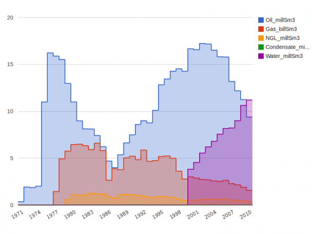
 For the standard area chart, data is displayed using different colors or shading in the space below the line. Area charts are commonly used to display accumulated values over a period of time.
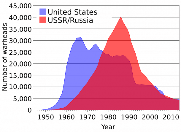
Stacked
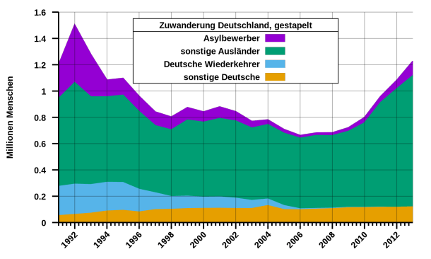 Stacked area charts are used to represent cumulative totals using numbers or percentages over time. They make it easier to visualize part-to-whole relationships. They show how each category contributes to the overall total.
Stream
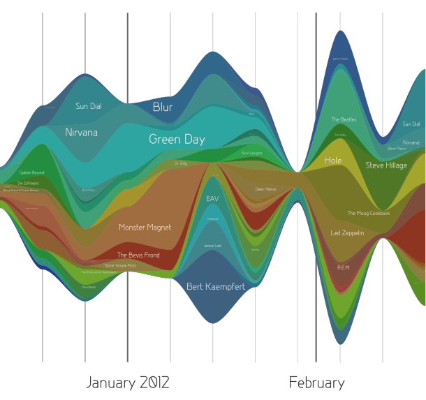 Stream charts are unusual and not used often, but still worth mentioning. A stream area chart is a generalization of a stacked chart with the baseline shifted to the center. The height of each individual color shows how the value of that stream has changed over time. The length of the stream shape shows its duration.
Stepped
 The stepped area chart can be used when you want to show a trend and highlight the increase or decrease in values over time. This type of area chart might be useful if you need to show the change in price over time for gas, bus fare, or stamps.
How to Use Area Charts
Area charts allow you to view the overall trend rather than individual values. They can be very effective if you design them properly, but they run the risk of being cluttered and hard to read. Here are a few tips and tricks for crafting an area chart:
1) Make it easy to read
- Avoid occlusion – This happens when one or more layers covers important information on the chart.
- Make your layers transparent if it makes each one easier for the viewer to comprehend.
- If you have too many data sets to visualize, make a line graph instead – it’s cleaner!
2) Use a stacked chart for multiple data sets if you want to emphasize part-to-whole relationships
- Stacked charts are helpful when the area under the plotted line represents a summation or percentage.
- Helps to understand the relationship between the data sets and how they change over time.
3) Area charts help the viewer look at the bigger picture – Take population for example…
- Line charts are good for showing net change in population over time.
- Area charts are good for showing the total population over time.
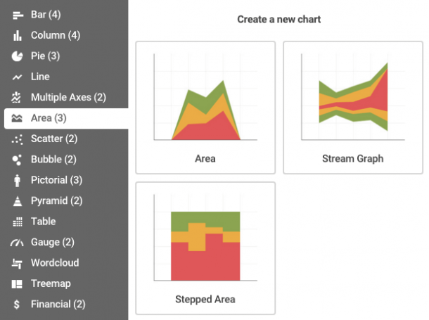
Infogram offers three of the most common area chart types, making it easy for you to create your own stacked, stream, or stepped chart in minutes!

Get data visualization tips every week:
New features, special offers, and exciting news about the world of data visualization.